Archives of Thursday Comics Hangover
Thursday Comics Hangover: Class war is hell
The illustrations in the new comic from Kaare Andrews, Renato Jones The One%, resemble Frank Miller’s artwork — particularly from his Dark Knight Returns era. Throughout, you'll find chiaroscuro layouts and plenty of exaggerated, pinched facial expressions. Andrews has bitten Miller’s style in just about every way imaginable. But Andrews’s art, once you look deeper than the surface, doesn’t really have any life to it; his art resembles Miller’s without the years of hard labor that made Miller such an icon. It’s got all the pizzazz and energy of a pencil sketch on a piece of tracing paper.
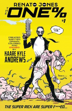
The book gets worse when you start reading what’s inside the word balloons. The first issue of Renato Jones is the titular character’s origin story, which is a riff on Batman: when he’s a child, Jones’s wealthy parents are killed in a home invasion. With the help of an older family friend, a hardcore Alfred Pennyworth figure named Church, Jones declares war on the corrupt wealthy even as he pretends to be an idle one-percenter in his secret identity. (Presumably, Andrews has some twists in store, because this premise is so clearly a rip-off of standard comics tropes that it’s embarrassing.) Here’s a passage from early in the comic, broken up in captions over a silhouette of Jones standing with a comically large gun:
For twenty years, they’ve been murdering the working class. Decimating wages, destroying benefits and killing jobs. They’ve crashed the economy, destroyed families and stolen their homes. They’ve turned the middle-class poor and the poor into convicts. Still you won’t find any of THEM serving time. The “ONEs” have bought their way out of judgment. With that kind of money, that kind of power, how can anyone stop them? How can anyone make them pay? Who will make them pay?!
Okay. I’d argue it’s been forty years and not twenty, but most of the first part of that quote is correct: the wealthy have changed the contract for working-class Americans, and our current economy is unsustainable. What Andrews is playing with here is populist outrage, which is obviously a correct reading of the American political climate. Look at the support that Bernie Sanders (or, hell, Donald Trump) has garnered and you’ll see an America that is fed up with income inequality and its attendant political inaction. But Andrews’s sausage-fingered attempts to capitalize on this divide are laughable, and though he’s seemingly coming at it from the more liberal side of the aisle, Andrews brings all the wit and grace of a Sean Hannity to the political conversation.
Jones’s first target is Douglas Bradley, a “Hedge fund manager and self-described philanthropist” who hosts Jones on a “yacht” that is drawn to look more like a cruise ship. Bradley is so obviously a bad guy that he might as well shoot a child in the head the first time we see him. He cozies up to Jones immediately, saying “Let’s hit the hot tub, dude. Talk some GMOs. This hybrid crop shit isn’t gonna solve world hunger, dude, it’s gonna monetize it.”
If that’s not a clear enough indicator that he’s a bad guy, soon Douglas is kicking a maid in the stomach, telling Jones “they’re not even people. Not at ten dollars an hour, dude.” Then, Douglas sees Jones’s alter ego, a gun-wielding hit man named The Freelancer, murdering his staff, and he’s in disbelief: “Thought this dude was a fairy tale,” Douglas says, “Like government regulation.”
Eventually, we learn that Douglas is even worse than Andrews has led us to believe. (Which is remarkable, considering he starts at reprehensible and only gets worse from there.) And then we learn Renato Jones’s catchphrase when he blows away the bad guys: “Choke on thi$.” Yes, with the dollar sign. No, I’m not sure how “thi$” is pronounced, though I like to picture it as the chime on an old-timey cash register as it opens.
Let’s lay this out as clearly as possible: Renato Jones is a terrible comic. Andrews’s art is punishingly ugly, his dialogue trots past laughable into cringeworthy territory, and the story mangles serious issues with what seems to be a dunderheaded earnestness. I’m not saying that class warfare is a bad idea for a comic — hot-topic political issues have always blended well with comics, ever since the days when Captain America decked Hitler on the cover of his first issue, back when America was trying its damndest to stay out of World War II.
But this hideous book wants to have it both ways. It wants to claim the moral high ground on income inequality while also glamorizing the extravagance of western hyper-violence. It wants to rage against the corporate machine while blatantly ripping off corporate superheroes like Batman and the Punisher. It wants to address economic topics without actually having to talk about economics. And it wants to profit on the zeitgeist-y loathing of the status quo while promoting an aesthetic that celebrates the worst of the last four decades of mainstream comics. If I could describe Andrews’s style in one word, it would be Reaganomics: it’s bloated and shallow, ahistoric and nihilistic, gaudy and vapid. This is a serious contender for the worst comic book of 2016.
Thursday Comics Hangover: Everything you need to know about Free Comic Book Day
This Saturday is Free Comic Book Day, the day when, duh, participating comics shops give away free comics to anyone who walks in. You can find the comic shop closest to you here. Some things to know:
If you’re looking for a good book, try the FCBD edition of the first issue of Archie, by Mark Waid and Fiona Staples. I reviewed it when it came out back in July of last year. It’s a surprisingly great high school drama with interesting characters and it drops you in the middle of a compelling story.
Other must-grabs include Mooncop, a sampler of comics by the very funny cartoonist Tom Gauld; Help the CBLDF…Defend Comics, a promotional book from the free speech advocates at the Comic Book Legal Defense Fund including comics by Craig Thompson and Lucy Knisley; the Love and Rockets Sampler Edition from Fantagraphics — if you haven’t read Love and Rockets, this is the one you have to take home — and March, a comic book history of the civil rights movement by Congressman John Lewis.
Some other intriguing titles include Z2 Comics Lab, We Can Never Go Home/Young Terrorists, and Camp Midnight, an all-ages story about a girl who accidentally gets sent to a summer camp for monsters. Really, if something looks interesting to you, you should grab it. After all, it’s free.
Also, as I mentioned on this site earlier this week, you should absolutely be reading Ms. Marvel, which is written by local author G. Willow Wilson. Wilson will be signing books at Phoenix Comics on Broadway from 12 to 3 pm on Free Comic Book Day, and she’ll be joined by Brooke Allen of the very fun comic Lumberjanes and Zach Davisson, a translator of Japanese comics.
If you’re looking to visit Arcane Comics this FCBD, you should be advised that earlier this week, the shop moved from Ballard to 152nd and Aurora up in Shoreline. Their new address is 15202 Aurora Ave N, Shoreline, WA, 98133. Arcane has always been one of the friendliest, best-stocked comics shops in town, and so you should definitely drop by and show your support.
If you regularly buy comics, you can absolutely take part in FCBD. But you should also remember that Free Comic Book Day isn’t free for shop owners; they have to buy the comics you’re taking. So if you're already a comics supporter, it’s polite to buy something — the first issue of a graphic novel series you’ve been interested in trying, say. Think of it as a subsidy: your purchase is helping to pay for the comic books that are bringing in the new readers who will help keep your comics shop thriving for years to come. Most local shops make FCBD easy on your wallet. Comics Dungeon in Wallingford is having a fairly expansive sale, for instance, and so is Dreamstrands Comics in Greenwood. Phoenix Comics is letting customers roll the dice to determine their discounts. And Fantagraphics Bookstore and Gallery in Georgetown is serving wedding cake.
Visit more than one shop. Seattle has a vibrant comics community in large part because it’s packed full of well-stocked comics shops staffed by friendly salespeople. FCBD is a time to celebrate this wonderful resource. Have fun. Be an unapologetic nerd. Go find a new comic to love.
Thursday Comics Hangover: Super weird
Superhero comics are supremely weird. What started out as a simple formula — every issue features a fight by page seven, a little bit of soap opera, and the beginning, middle, and end of a battle between good and evil — has now become a weirdly self-reflexive vocabulary that pretty much is only used to describe itself. Even as superhero movies have become the most popular genre at the multiplex, it’s hard to understand modern superhero comics without comparing them against years of knowledge of the genre.
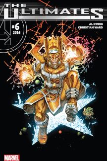
This doesn’t mean they’re necessarily bad. The sixth issue of The Ultimates, written by Al Ewing and illustrated by Christian Ward, is an almost impossibly weird comic book. Unless you’re familiar with fifty years of Marvel superhero history, you’re almost guaranteed to be totally lost. The main character of the story is Galactus, a giant space god who wears a ludicrous helmet and eats planets for a living, as he tries to discover who has chained up the living personification of the universe. Along the way, he hits a giant disembodied space-head right in the face. (“On our level, combat is metaphor,” Galactus explains, “A clash of ideas.” Okay.)
What Ewing is doing with The Ultimates is pushing comic book physics to its limits, examining superhero time travel and its repercussions, and dissecting the impossible sci-fi physics created by Jack Kirby in the 1960s. It’s almost impenetrably postmodern, a wild and weird journey through four-color quantum physics. If you spent years of your youth wondering how the Marvel Universe doesn’t collapse in on itself from all the time-travel and alternate-dimension hopping its heroes do, this is the book for you, a metatextual journey through gaudy superheroic philosophy. If you have no idea what I’m talking about, you should probably give it a miss.
This week also saw the end of writer Scott Snyder and artist Greg Capullo’s run on Batman. Their Batman has been one of the only roundly applauded creative runs of the DC Comics "New 52” reboot initiative, in which their entire line was relaunched in hopes of finding a new audience. (Given that DC is about to reboot their entire line again next month, the New 52 seems to have mostly been a failure.)
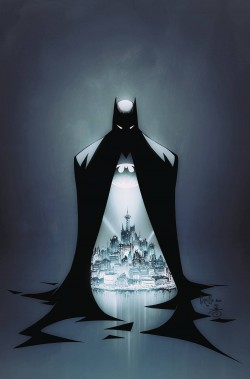
Much of Snyder’s reign as writer has, frankly, not appealed to me — his interpretation of the Joker as a psychopathic butcher whose face was removed, dried out, and then worn on top of the exposed muscles of his face as a mask was, uh, a little over-the top. But other parts of Snyder’s run have been incredibly fun, most notably the last stretch, which featured Commissioner Gordon stepping in as Batman in a goofy superhero fantasia.
Thankfully, Batman issue 51 — the final collaboration between Snyder and the highly competent Capullo for the forseeable future — leans more toward the fun superhero side of Batman than the pair of overly grim and gruesome Joker stories Snyder wrote into the run. This is a Batman who has time to joke around with Alfred. He’s confident enough in his masculinity to walk around in Capullo’s smart redesign of the Batman costume, which features splashes of color like yellow and — gasp! — a purple lining to his cape. Sure, the story gets a little hammy, but a Batman comic without operatic symbolism isn’t much of a Batman story, after all.
In the end, Snyder and Capullo are leaving the character in better shape than when they started. Rather than the ridiculously obsessed Batman of the 80s and 90s, their Batman is a little looser, a little more vibrant, and a lot more fun. What’s the point in doing a superhero comic, they seem to be asking, if you’re not going to get a little weird with it?
Thursday Comics Hangover: Mini comics, big love
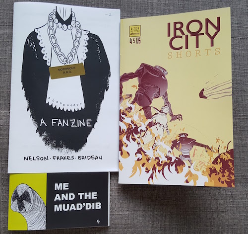
It was kind of a boring new comics Wednesday from the mainstream publishers, so I decided to dive into the minicomics section of Phoenix Comics & Games to see what local cartoonists are working on. Or, in one case, what local cartoonists were working on; I had never seen the 2014 Justice Ruth Bader Ginsburg fanzine Notorious R.B.G. before, so it was new to me. (It also predated the 2015 Christmas bestseller Notorious R.B.G. by a year.)
The zine from poet Amber Nelson, cartoonist Colleen Frakes (author of Prison Island) and cartoonist Neil Brideau, which is “Dedicated to Ruth Bader Ginsburg with apologies to Beyonce,” is a collection of song lyrics rewritten from Ginsburg’s perspective. (“My mother told me two things;/to be a lady and to be independent.”) As a tribute to Ginsburg, and to the other women on the Supreme Court, it’s a delight, and at two bucks, it’s a steal. My favorite bit is the two-page comic-strip cover of “Flawless” that caps the book. (“Woke up like this/Flawless/Supreme Court steps/Flawless…”)
Joseph Laney’s Iron City Shorts is a $4 minicomic collecting two short stories set in and around the fictional Iron City. The setting is a kind of retro-sci-fi groove, with giant robots and goggles and dirigibles. The first story, “The Big Knockover,” feels a bit slight, but the second story, “Escape the Past,” more than makes up for the first in terms of storytelling strength. “Escape” begins with a prison break (from, as a caption helpfully informs us, “Gargantua Island Prison: one of City Harbor’s most notorious landmarks”) and continues with a twisty tale of revenge that incorporates several moral shades of gray. Laney’s sense of design is excellent. He packs a lot onto every page, and his chunky cartooning style — which kind of reminds me of a sci-fi Dean Haspiel — serves the subject matter very well. He’s obviously put a lot of thought into Iron City as a setting and a theme, and hopefully this sampler will function as a springboard for more adventures soon.
Finally, Eli Tripoli’s Me and the Muad’dib is a demented mashup that somehow makes perfect sense: it’s a Chick tract-style evangelical pamphlet extoling the mythology of Frank Herbert’s Dune series. While Tripoli’s art is primitive, the glorified stick figures ably serve the narrative — a pair of supporters of Paul Atreides try to convince a skeptic to believe in the Emperor of Dune. The language is spot on for a Chick tract parody: “Paul Atreides isn’t a giant fish, he’s the Kwisatz Haderach! He’s a person like you or me. And he was born here on Calderan, just like us!” As a celebration of Herbert’s super-weird mythology, it’s glorious — a respectful work of fandom that’s clearly born from a deep and abiding love. Come to think of it, that describes all three of these books.
Seattle shows up for the 2016 Eisner Award nominations
The 2016 Eisner Award nominations have been announced — the Eisners are basically the Oscars of comic books — and Seattle is well-represented this year. Fantagraphics Books is the most-nominated company of the year, with a whopping 17 nods. (One of Fantagraphics' most-nominated titles is The Eternaut, which I reviewed here at the Seattle Review of Books back in December.)
Other Seattle-area nominees include The Oatmeal's Matthew Inman, who was nominated for his strip "It's Going to Be Okay," and G. Willow Wilson, who was nominated for Best Writer for her work on Ms. Marvel. Other Eisner nominees that have been reviewed by the staff of Seattle Review of Books includes:
- Kaijumax, a series about giant monsters imprisoned on an island.
- The wonderful new series Paper Girls by Brian K. Vaughan and Cliff Chiang.
- Giant Days, a comedy series from Boom! about young women in college.
- Nimona, a fantasy comic by Noelle Stevenson.
- And The Thrilling Adventures of Lovelace and Babbage, by Sydney Padua.
Congratulations to all the nominees, and here's to Seattle making a strong showing as the great comics town we all know it to be. It's great to hear, too, that this is a record-breaking year for women at the Eisners.
Thursday Comics Hangover: The Fix is in
Last week’s big book news was obviously the first issue of the Black Panther from Ta-Nehisi Coates and Brian Stelfreeze, but there was another debut that deserves your attention, too. Nick Spencer and Steve Lieber’s new series The Fix is a crime comic with relatively small stakes, but it’s entertaining as hell — funny, dirty, and charming all at once.
Spencer and Lieber earned a cult following with their work on Marvel’s Superior Foes of Spider-Man series, which was a funny heist comic featuring some D-List Spider-Man villains. Foes was for a while my favorite book from the big two superhero publishers, with its self-effacing sense of humor and twisty plot. Spencer’s script doesn’t skimp on the words; the pages are full of word balloons and captions that amplify our understanding of what’s on the page. (He never over-explains, or steps on the artist's job.) And Lieber’s art is clear, character-based, and packed with fun details.
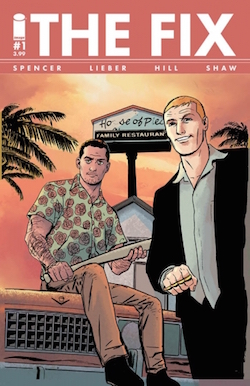
I can’t give away too much of what The Fix is about without ruining the fun, but it opens with a heist gone wrong, continues with a character study of a dirty cop, and then raises the stakes into a caper that can’t possibly end well, with a perfect little cliffhanger ending. Every twist has a second twist layered on top of it, and none of those storytelling reversals feels manufactured or cheesy. Spencer’s dialogue — kind of Elmore Leonard-y, though with more semen jokes — keeps things running smoothly. (Seriously, there’s a lot of sex talk. You should be warned that occasionally the chat leans in the direction of gay panic, but it always skitters away at the last minute.)
The Fix is at the very crest of a tidal wave of heist comics coming at us. This week saw the first issues of Jackpot (a decent heist comic that suffers a bit from terrible art) and Heartthrob (a very promising ghost story/heist comic), and the next few weeks will see the debut of another series called 4 Kids Walk Into a Bank. The question has to be whether an ongoing serial medium like comics can sustain the amped-up pressure that the crime genre demands. I’d expect at least half of these series to flag after a few issues, but Lieber and Spencer proved with Foes that they could keep a crime story going for at least three fairly thick trade paperbacks. I’d expect The Fix to keep running on high power for the next few years.
Thursday Comics Hangover: Everybody's talking about the Black Panther
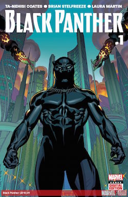
With all due respect to Stelfreeze, who is one of the best cover artists in superhero comics, those sales are due to the fact that everyone is anxious to see how Coates does with a new medium. Readers expecting a superheroic sequel to Between the World and Me — whatever that would even look like — will be disappointed. Coates has indicated repeatedly that he’s a lifelong fan of Marvel Comics, and that he’s interested in writing a superhero comic.
And so Black Panther is a superhero comic, through and through. It opens with a big fight, packed with laser blasts and super-powers and costumes. It’s dramatic, even operatic, and it’s a lot of fun to read. But even Coates at his nerdiest is still Coates, and his day-job interests are on display here: politics, race, violence, capital punishment. Even the plot seems of-the-moment for a United States whose political structures are hemorrhaging themselves to pieces: the Black Panther is a king of a high-tech African nation called Wakanda, but after years of turmoil his people seem ready for a new ruler.
Like some of the best superhero comics, Black Panther proudly waves the banners of its influences: Kanye West lyrics, tributes to other comics creators, elements of Afrofuturism. Coates is slathering the pop culture on thick, here, and it’s delicious. He's especially gifted at dialogue; the economy of word balloons and captions often escapes writers more used to the vast expanse of prose, but the words on the page in Black Panther strike just the right mix of portentousness, exposition, and brevity. Here’s the Black Panther’s internal monologue from early in the issue:
I came here to praise the heart of my country, the vibranium miners of the Great Mound. For I am their king and I love them as the father loves the child.
But among my children, all I found was hate.
The hate spread.
And so there is war.
You can practically hear the soundtrack ramping up behind those words (Brum-BAUMM!!!!) It reads like Stan Lee-style overblown dialogue, but with more natural poetry to it. The cadence has a majesty, a foreign rhythm, and the condescending tone — thinking of his citizens as children — indicates that perhaps the insurrection has a point to it. Those few words do a lot of work.
And so does Stelfreeze’s art. It’s been years since I’ve seen Stelfreeze do the interior of a book, and I missed his skill at storytelling. Take those first few pages where the Panther faces a crowd of angry Wakandans: every aspect of the melee is laid out plainly. Actions have consequences that we can see, and it’s possible to follow faces in the crowd throughout the fight. Later in the issue, Stelfreeze’s designs for Wakanda incorporate a whole host of visual vocabularies — African art, Egyptian design, weird Jack Kirby technology —to create a corner of the Marvel universe that we’ve never seen before.
In the end, Black Panther has to be one of the strongest first issues from a superhero comic publisher in a long time. It doesn’t feel too slight, or too weighty. It’s a ridiculously stylish package, with production values that put most of Marvel’s other output to shame. And it firmly situates a long-standing Marvel character into his own corner of the world, finally giving him a role and a purpose and a voice after years of disuse. This is what superhero comics should be doing all the time: crafting cultural moments around unique characters who resonate with the politics of the day.
-
It will be interesting to see what new comics readers make of Black Panther. They might not know that you should read the comic over a few times in order to fully appreciate it. The advertisements spread throughout the issue might prove to be too jarring for them. They might consider the years of backstory to be off-putting, rather than intriguing. In fact, a good portion of prospective Black Panther readers should probably wait for the trade paperback to come out this fall, because collected editions tend to be closer to the traditional reading experience than monthly episodic comics. ↩
Thursday Comics Hangover: The Superman trick
In case you were staring out at sunny skies and planning what to do this weekend, let me just make one thing abundantly clear: Batman V Superman: Dawn of Justice is every bit as terrible as you’ve heard. It is not so-bad-it’s-good. It’s just bad: inept, crass, soulless, mean-spirited, and dumb. Don’t pay money to see it.
But this isn’t another review of that movie (the world doesn’t need any more of those) and it’s not another middle-aged white dude whining about his childhood being stolen from him (the world didn’t need one of those). Instead, I want to talk particularly about one commonly held belief: the concept that Superman is hard to write. If you Google the phrase “Superman is hard to write,” you’ll get over 2.6 million results, featuring articles with titles like “The Difficulty of Writing Superman” and “3 Reasons It’s So Hard to Make Superman Interesting.” This idea is absolute bunk, and I’ll explain why.
Here it is: A good Superman story is an inward-facing story. The conflict in a Superman story is almost never external. In fact, they’re almost always internal. Everyone imagines that Superman is hard to write because he’s invulnerable, and super-strong, and has super-senses, and so on and on and on. That doesn’t matter. When you’re writing a Superman story, you’re not trying to find his toughest opponent, or his most difficult physical challenge. None of that stuff—super-speed, laser beams—matters at all. Instead, you’re trying to challenge the idea of morality.
The greatest era of Superman comics were the books edited by Mort Weisinger in the 1950s and 1960s. It’s where most of the core Superman concepts came into being, and it’s where the greatest Superman comics of the modern age (the ones written by Alan Moore and Grant Morrison) found their inspiration. And if you read any Superman story from that time, you’ll find that very little of the plot has to do with Superman fighting anything.
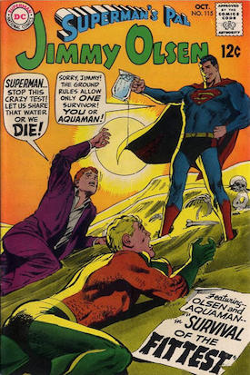
Think about the strange ideas those comics delivered on a regular basis: Superman. Supergirl. Beppo the Super-Monkey. Bizarro Superman. Superman Red and Superman Blue. Superboy. Comet the Super-Horse. Streaky the Super-Cat. The Legion of Superheroes. You could easily argue that there were no characters in Superman comics aside from Superman himself; everyone else was a reflection of his psyche and an exploration of his themes. It’s as interior as a Beckett novel.
The over-literal interpretations of Superman that followed the Weisinger years are to blame for making Superman boring. The New 52 reboot of Superman has never been interesting. John Byrne’s sad attempts to create sci-fi justifications for Superman’s powers were about as fun as counting each individual piece of gravel in a driveway.
At least the much-reviled Death of Superman storyline, which many blamed for launching the comics bubble that almost destroyed the superhero industry in the 1990s, delivered four different Superman characters to comics, including a new Superboy and John Henry Irons, who was later known as Steel. The creators of those comics understood that Superman was only compelling when his basic goodness was reflected and distorted onto other personas.
So listen: Nobody cares about how much Superman can lift, or how hard he can punch, or whether he can beat Batman in a fistfight. The trick is this: think about the most decent person you can. Put pressure on that person. Imagine what would happen if that person happened to be, say, from the poorest one percent of the USA, or from a part of the world ruled by a tyrant, or raised by an Objectivist. What happens then? Is he still good? What if he’s in a situation where he has to confront a mistake he’s made? How does he behave then? What happens next?
Thursday Comics Hangover: A Yeti sighting
Over the weekend at the APRIL Book Expo, The Seattle Review of Books table was directly next to Yeti Press, the small comics publisher run by Fantagraphics employee RJ Casey in his free time. (Yes, Casey runs a comic book company when he’s not busy working at a day job for a comic book company. I suspect he also runs a smaller comic book company when he’s looking to unwind from his other two comic book companies.) In between visitors, I asked Casey what Yeti’s newest comic was, and he handed me a small comic titled beds! Beds! BEDS!.
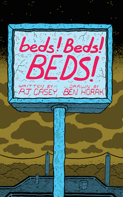
“You know what, honey…I just love you with all my heart,” the father says to the mother. And then they make out, and it’s a truly unsettling panel. Horak draws every single line in their entwined tongues and every single particle up their noses, as a leering, big-eyed baby looks on. Horak is clearly playing up the grotesquerie here, going for a kind of JR Williams-meets-Ed “Big Daddy” Roth kind of feel. Everything is cartoonish, but also heavily detailed, with every wrinkle and sag and flaw accentuated for utmost impact.
beds! Beds! BEDS! is a very short comic about the horrors of commerce — the creepiness of salespeople and the discomforting entitled self-satisfaction of the American family. It’s a straight-up caricature of a scene that plays out across the country every day (a family buys a bed for a kid who has outgrown a crib) but with all the throbbing veins and emotional neediness and other gory details amped all the way up. Bed shopping has never been so alarming, or so craven, or so hideous.
This is the sort of thing that comics published by Casey’s Yeti Press do best: using experimental and energetic comics, they focus on one single thing — a sandwich, say, or a ballpark mascot — using comics that simultaneously draw you in and repulse you. If Mad Magazine were still relevant today, they’d likely be publishing comics like beds! Beds! BEDS!, rather than the same old tired movie parodies that have become their stock in trade. Yeti Press’s books may not appeal to everyone, but they fill a necessary function in the comics world: they’re the punky, adventurous outsiders who aren’t afraid to make the uncommercial decision, much to the delight of a small-but-avid audience of cartooning aficionados.
Thursday Comics Hangover: Love at first sight
Artyom Trakhanov, where have you been all my life? Trakhanov is the artist for a new miniseries from Boom! called Turncoat, and his art is unlike just about anyone working in the American comics business today. Trakhanov’s art is along the lines of European comics artists, (which makes sense, since he’s Russian) meaning it’s obsessively detailed, focused on different kinds of panel-to-panel transitions than American counterparts, and packed full of interesting, unique characters. It’s unbelievably pretty, yes, but it’s also dense and ornate, like a woodcut come to life.
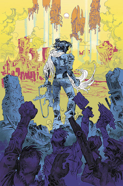
It’s not fair to the rest of Turncoat’s creative team that I can’t stop talking about Trakhanov’s art. It’s a sci-fi noir about a human woman who served on the police force for an invading alien force (called “the management”) before betraying her alien masters to a resistance force. The aliens, after 300 years of domination, are finally forced off the planet thanks to information supplied by Marta. This leaves her in a precarious position, as a friend tells her early in the book:
This won’t be clean, Marta. You know that, right? Lotta bad people lived too well under management to just hand over the keys to the world….Timing’s everything, pal. You gave us what we needed to hurt ‘em where it hurts, sure, but you did it just a touch too close to the end. Now both sides are gonna take you for a carpetbagger.
Five years later, Marta is a lonely woman, a private detective who gets assaulted randomly by both former pro-human resistance forces and alien sympathizers alike. She takes on a case that smells bad, and early clues indicate that it might lead to the management’s return. Alex Paknadel’s script is very strong — packed with information without feeling leaden — and it juggles genre tropes with a delicate touch. Paknadel could probably carry a lesser artist with his novelistic approach (there are more words per page than you’d find on five or six pages of your standard Marvel comic) but with an artist as naturally gifted as Trakhanov, it takes a couple readings before you realize how well-written the whole thing is.
Turncoat is walking down a dangerous path. It’s easy to imagine the many alien invasion/private detective clichés that the script could fall prey to in its remaining three issues. But as long as Trakhanov continues to draw the series, every issue will be, at the very least, worth the cover price just in terms of sheer stare-worthiness alone.
Thursday Comics Hangover: Doctor's orders
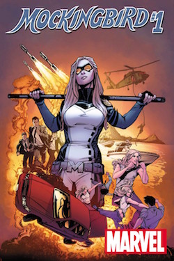
Mockingbird feels like the first chapter to a well-structured story. Most of the book takes place in a doctor’s office; Mockingbird is called in for frequent checkups due to her exposure to a volatile super soldier serum in her origin story. (She asks the reader in one caption: “If you could live forever but had to have a colonoscopy every week for the rest of your life would you do it?”) The book has an irreverent sense of humor to it. Tony Stark, in the opening scene, sits in the same waiting room as Mockingbird, casually flipping through a pamphlet on gonorrhea. The book skips forward in time through several of Mockingbird’s doctor visits. Her health deteriorates, but she lies to her doctors about it. Supposedly important events happen in between the visits, but we don’t know what they are. One of them involves a corgi.
In a note at the end of the issue, Cain admits that the first issue “makes no sense,” which is selling herself short. She explains that the next three issues of the story will spell out what happens in between each of the doctor visits, and then the fifth issue will tie the whole story together. It’s kind of a shame that Cain felt compelled to give away the structure of the story in a prose piece at the end of the first issue, but the volatility of the comics market probably demanded it; mainstream comics are selling so poorly nowadays that new series might not even get five issues with which to prove themselves.
Mockingbird is a series that deserves to survive. Unlike most novelists who break into comics, Cain is excellent at the form; she doesn’t overwhelm the reader with too many words, and she trusts her artist to tell the bulk of the story. The artist, Kate Niemczyk, is especially good at drawing people: her characters are eminently watchable, with lively body language and expressive faces. Niemczyk also pulls off some fun iconography tricks later in the issue, which help demonstrate the increasing mental pressure on Mockinbird to perform correctly during her medical examinations.
The coloring by Rachelle Rosenberg, too, is exceptional. It feels, and I mean this as a compliment, very comic-book-y, with a lot of vivid primary colors throughout. But Rosenberg also lays down quite a few patterns in the issue — a swirly circle pattern on one nurse’s scrubs, a floral pattern in one office, a beautifully garish explosion pattern behind Mockingbird in a climactic panel — that add to the atmosphere of intricacy.
Together, the three creators manage to tell a psychologically engrossing spy story told almost entirely in visits to a health care provider. The drifting sense of loyalty you find in most good espionage thrillers works exceptionally well in a medical setting. Everybody lies to their doctor, as Mockingbird notes in the issue, but what if your doctor was actively plotting against you? Worse, what if you couldn’t tell if your doctor was trying to do you in or not? It’s enough to make somebody sick.
Thursday Comics Hangover: The paper chase
For years, film nerds and comics nerds used to get in silly fights over which medium was better. Comics nerds would argue that you could do literally anything on a comics page, while budgets and the constraints of reality meant that movies had some natural restrictions on how far-out they could get. The dawning of CGI simultaneously imploded this argument and proved it correct; as soon as great computer special effects made it possible to put anything onscreen, superhero comics basically started dominating Hollywood’s blockbuster space.
I’ve seen a few of those message-board altercations end with the movie-nerd’s argument that a comic can never successfully portray a car chase with the same intensity and kinetic energy as a cinematic car chase sequence. It’s the kind of thing that comics nerds can’t really fight back against: one of the best aspects of comics — the fact that the reader is in complete control of the passage of time — also makes it difficult to portray breakneck action.
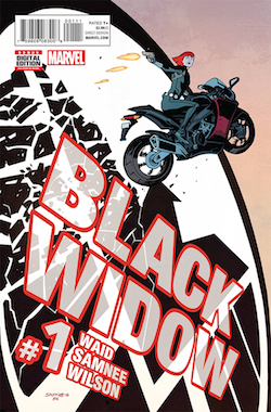
The trick to this, of course, is the creative team. This Black Widow is from writer Mark Waid and artist Chris Samnee, who recently wrapped up a long and refreshing run on Daredevil. In the letters page to the first issue, Waid explains that Samnee has more of a hand in the storytelling on Black Widow than he did on Daredevil; the pair have become co-plotters, with Samnee blocking the pages out on his own, and Waid adding the final dialogue to fit the art. It’s a different kind of collaboration, and it shows on the page. This doesn't feel like a Daredevil do-over; it's a whole new comic.
Samnee doesn’t get overindulgent with splash pages and easy-to-draw sequences, the way some artists do when they take up more of the creative reins. If anything, his gorgeous, simplified linework has become a little more detailed than in previous comics. The choreography of characters has become a little more involved than ever before. He’s challenging himself, and rising to the challenge. Superhero comics haven't seen this kind of a minimalist with a fluid grasp of panel-to-panel action since David Mazzucchelli moved over from Batman to art comics.
That said, a couple of sequences — involving the stealing of a jetpack and that jetpack’s explosion — could use a little more clarification. I’m not entirely sure how the cause-and-effect of those panels play out, though Samnee and Waid’s depiction of the Black Widow as an impossibly confident, competent figure certainly helps the reader make a leap. (“Of course she survived; she’s the Black Widow.”)
This issue provided several opportunities for the Black Widow to display her ability to manipulate even knowing marks into doing her bidding; hopefully future issues will examine the morality behind that skillset a little more closely. While the comic does a better job of portraying the Black Widow’s gifts for action than all her movie appearances combined, I can’t wait to see more of the superspy qualities that the movies gloss over.
This first issue of Black Widow is the kind of memorable comic that future artists will probably identify as a major influence in their work. And that’s fine; this is exactly the kind of superhero comic we want younger generations to try to emulate. Hopefully Samnee and Waid will maintain this frenetic energy throughout the series. If they build up a good long tenure on Black Widow, they’ll coincidentally prove another argument why comics are better than film — a movie has to end within a couple hours or so, while comics have the endurance to keep a character running for years.
Thursday Comics Hangover: The final countdown
Two more to go. The 18th issue of Intruder, Seattle’s free, invitation-only comics anthology, is available around town right now, which means only issues 19 and 20 are left before the whole operation folds. Everything seems more acute when a countdown timer’s running, of course, so it’s hard to say for sure, but this issue of Intruder certainly feels more…Intruder-ier than ever before: thicker, full of a wider variety of comics, even livelier than usual.
One of the high points of this issue is Tom Van Deusen’s “Autobiographical Comic Strip,” in which a seemingly mundane trip to the UW Medicine building in Ravenna is upturned by some delightful physical comedy involving a duck. Van Deusen’s art keeps getting tighter and more interesting with every new pages of comics he produces; he’s starting to develop a line that looks very similar to former Seattle cartoonist Jason Lutes, only with more of a sense of fun.
Other strips in this issue share that absurdist comedy vibe. Brandon Lehmann’s dark-but-funny “Stranger Danger” is about a wizard who keeps alternating attempts to lure a young boy into his van with exasperated outbursts when the boy is too easily duped. Seth Goodkind reaches out to a horrific newspaper comic strip deity in hopes of discovering the secrets of comedy. Marc Palm’s strip investigates the weird world of sexually experimental music.
But this issue of Intruder also presents some social commentary — “Urban Distress,” by Marie Hausauer delivers a modest proposal combining haute couture and Seattle’s homelessness problem — and an earnest David Bowie tribute from David Lasky, along with surrealist art pieces like Tim Miller’s full-page illustration of…well...something — a quasi-religious pin-up featuring a bunch of arms and shapes and white space that looks like it could change your life under just the right blend of hallucinogenic drugs. In fact, Intruder has even less of a house style than it did a few months ago. The issue sprays from earnest to painfully ironic, from dense craftsmanship to abstract carelessness. If you can find a thematic link between all these strips, you’re a more astute reader than I.
Since Intruder’s organizers announced the impending end of the magazine, Intruder has only become more interesting. It feels less like a ferocious, impassioned mission statement for Seattle’s comics community, the way it did when Intruder first started, and more like a celebration of itself. With each passing issue, Intruder looks more like Intruder as it prepares to disappear forever. These are the issues that young cartoonists will try to evoke in years to come when they put together their own anthologies. I can hear them now — telling each other, “no, we should make it more like Intruder,” and everyone will know exactly what they mean by that.
Thursday Comics Hangover: The masterful banality of Beverly
 If you were to ask me to nominate one cartoonist to create a comic book adaptation of a Todd Solondz film, I would, without a second thought, choose Nick Drnaso. Like Solondz's films, the world in Drnaso’s new collection Beverly is ugly and mundane; unattractive Americans live their boring lives in bland surroundings — cut-rate hotel rooms, tract housing. Drnaso draws his figures with simple lines, often at the middle distance. He rarely employs close-ups; his characters lack detail or much by the way of physical nuance. It’s a kind of bland suburban hell.
Put simply, Drnaso tells the stories of creeps. A young boy embarrasses himself in spectacular, sexual fashion on a family vacation. A lonely man gets a massage. A young woman reports a horrible crime that puts the community on edge, though the details start to fall apart on closer investigation. You wouldn’t want to spend any time with the people in Beverly. At best, they’re bumbling and a little bit slow. At worst, you’d move away from them if they tried to sit next to you on the bus.
And yet, Drnaso is a masterful storyteller. With great economy and supreme confidence, he constructs whole worlds — worlds of mundanity, filled in with rainbows of beige — and he populates them with people who don’t experience desires so much as vague fumbling in the general direction of happiness. The most innocuous protagonist is a mother who is excited to take part in a television market research survey; it’s such a small want that when it collapses in disappointment, the sadness somehow feels even more profound.
Beverly will make its readers uncomfortable. That must be part of Drnaso’s plan. Rather than skip through the awkward sitcom the aforementioned woman is excited to watch as part of her marketing survey, Drnaso lays the whole TV show out in tiny panels, and it’s just as bad as the most mediocre TV show you’ve ever watched. ”Sorry for the way I acted earlier,” the bland father says to his bland wife as they get into bed at the end of the show. “You and the kids are too good to me.” His wife replies, “Oh, honey, you’re too good to us!” Turns out, you can make a comic that’s just as awkward as bad network television. All it takes is a whole lot of talent and a ferocious willingness to maintain a chilly distance between you and your readers. Like the worst television, you can’t look away from Beverly — you’re hypnotized by all the horrible beauty.
Thursday Comics Hangover: Mean girls gone wild
Some of the best comics-minded thinkers — Grant Morrison, Kieron Gillen, Kelly Sue DeConnick — love to talk about comic books in musical metaphors. It’s an apt comparison; sometimes going to the comic book store and picking up a few comics is reminiscent of visiting the record store and walking out with a bag full of singles. They’re tiny bursts of art in an eminently consumable, commercial format, and they have their own aura of cool about them.
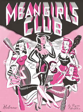
It helps that the whole comic as an object is aesthetically pleasing. Published by London comics company Nobrow as part of their 17x23 series — described as “a graphic short story project designed to help talented young graphic novelists tell their stories in a manageable and economic format” — Mean Girls Club is a beautiful package. It’s squatter than most comics, squarish, printed in shades of hot pink on quality paper with french flaps. Very few comics these days, aesthetically, look this good.
Mean Girls Club is a short story about a street gang of unruly women: Pinky, Wendy, Sweets, Blackie, Wanda, and McQualude. They torture innocent people. They take fistfuls of pills and slap each other with fishes and punch well-meaning nurses right in the jaw. And then the mayhem really starts.
Heshka’s retro art recalls a cross between Richard Sala and Charles Burns, and he squeezes invention out of the limited color palette on every page. Most readers of Mean Girls Club will burn through the book in a matter of minutes, but they’ll want to read it over and over again, because it’s just so damn catchy and pretty and funny and raw. If this was a record, you’d wear out the grooves in a matter of weeks.
Thursday Comics Hangover: Bernie Sanders, comic book hero
Last year, cartoonist Ted Rall visited Seattle with Snowden, a comic book biography of Edward Snowden. (I reviewed Snowden and interviewed Rall onstage at Town Hall.) Only a half-year later, Rall’s back, and reading at Town Hall tonight from his brand-new Bernie Sanders biography, Bernie.

Bernie opens with a long, substantial explanation of how the Democratic party leaned to the right in response to George McGovern’s crushing defeat at the hands of Richard Nixon. Rall argues that the party has drifted steadily rightward ever since. (I would counter-argue that Barack Obama is a decidedly more liberal president than Bill Clinton, but I freely admit that this criticism might fall along partisan, rather than aesthetic, lines; in any event, Rall makes a convincing case and supports it with plenty of evidence.)
Ultimately, Bernie isn’t as good a book as Snowden was. It feels rushed, and the many pages depicting a cartoon Sanders speaking are less visually interesting than the explanatory illustrations of Snowden. Too much of the book is spent on a straight-up biography of Sanders, describing his first, failed marriage and his many runs for office. Perhaps it sounds odd to criticize a biography for being too focused on biographical details, but in a presidential year it seems as though it would be more useful to examine Sanders’s policies in more detail, to explain why they’re not too far removed from the global mainstream. Rall mentions many of the policies in passing — single-payer health care most particularly — but a thorough description of them would do wonders to normalize Sanders for a more skeptical audience.
Rall does try to provide a warts-and-all portrait of Sanders, mentioning his occasional support for NRA-approved pro-gun laws and his support for President Obama's drone assassination program. He also brings up, but doesn’t fully address, two very important criticisms of the Sanders campaign: the belief that Sanders couldn’t win the presidency and the corresponding belief that even if he were to become president, he would be unable to break Congressional gridlock to achieve his lofty goals.
But Bernie is worth your time and attention if you’re looking for an explanation of how a decent man decides to run for president. It documents a long, honorable life of civic service and the ideological battle that is right now at the heart of the Democratic Party. When sharing a bookshelf with Snowden, the two books make up a duology of honor and responsibility and citizenship. In a presidential election year, this might be exactly what the American people need to read.
Thursday Comics Hangover: To be young and sad
Local cartoonist Elk Paauw’s minicomic It’s Okay to Be Sad Sometimes is a collection of short comics about sadness. Are all the sadnesses linked to a single cause? Maybe; it’s not entirely clear, though Paauw does allude to a breakup several times. In any case, the book works as a narrative about a single depression or as a thematic collection.
In the first couple pages, Paauw draws themself crying on a train; Paauw’s eyes are big, doe-y bubbles with leaking reservoirs of tears just underneath. A woman on the train turns to Paauw, who angrily replies, “Yes. I’m crying. Move on.” That’s the whole strip, and it seems to be a real you-get-it-or-you-don’t kind of an affair. Either you’ve been sad in public and can relate, or you haven’t and you don’t.
Recognition is key to the appreciation of Sad. The comics in the first half are all about being sad in various situations — buying ice cream, attending a party, riding transit — and the comics in the second half are about what happens when you try to climb out of it. (Will sex help? Is it even possible to find someone to have sex with? How does anyone successfully manage to have sex?) Most of the comics are just a few panels long, and the book feels slight, like a rough draft of something bigger (though for $5, you probably shouldn’t go in with expectations for a dense narrative in the first place.)
Paauw is a gifted young cartoonist. They use dense, almost Sharpie-like lines in their art, but the amount of expressiveness they draw from those lines is surprising. The manga-by-way-of-Scott-Pilgrim influences are clear, but not oppressive; unlike the exaggeration of the comics that influence Paauw’s art, these comics are strictly grounded in realism. You’ve made these faces, worn clothes that hang like this, hugged your mother and cried this way.
Sad is obviously a work by someone who’s just getting started as a cartoonist. You won’t find the shorthand and nuance of, say, a Peter Bagge comic here. But if your cartooning tastes veer more toward the punky end of the spectrum — those works of art that are all about truth and attitude and feelings — you’ll find a lot to like here. It’s a story of figuring it all out, written by someone who is standing on the crossroads, trying to decide what to do next. Whatever “next” entails for Paauw, hopefully they’ll keep making comics.
Thursday Comics Hangover: Sometimes no context is context enough
Recently, I visited a comic book store with a friend. She reads all kinds of graphic novels and collected comics, but she’d never spent more than a few minutes in a comic shop. Immediately, it became clear that for people who haven’t spent their whole lives in comic shops, there’s a bit of a learning curve to browsing. She picked up a comic and turned it over, looking for an explanatory blurb, like the one you find on collected comics. Of course, there are no blurbs on monthly comics. Aside from the cover image, there’s no indication at all what the comic is about.
Finally, frustrated, she asked me, “so how are you supposed to know what the comics are about?”
It was a great point. I explained that you could flip through the comic and see if you were interested, but mostly hardcore comic shop customers browse through a catalog months in advance, read promotional copy about upcoming comics, and order their comics based on that. It had never struck me exactly how weird this system is. Can you imagine what it would look like if bookstores — or, really, any other kind of art at all — relied on the same business model?
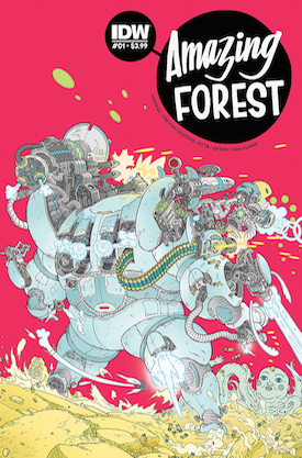
But that’s really all I know: are the stories supposed to be thematically linked? Two of them are weird science stories and two fall within disparate subgenres of fantasy. Reading Amazing Forest was a strangely unmooring experience, because I wasn’t sure if the stories were one-shots or the first installment in serial stories. (In retrospect, I’m pretty sure they’re all self-contained.) Only after I’d read the thing twice through did I begin to have a sense of what the comic was.
Amazing Forest is a Twilight Zone-style comic, which is to say each of the stories focuses on genre, and they generally feature a twist of some kind. Some of the stories are more engrossing than others. The first story, “Tank” — about a crew of men in a futuristic tank who have to battle victims of a plague who bear an eerie resemblance to long-lost loved ones — is good but a little too high-concept for eight pages. The twist in the second story, “Wolf Mother,” left me cold. “Ronnie the Robot” is an old-fashioned EC Comics-style riff, complete with a hoary climax that is pretty obvious, but which still feels satisfying. And the last story, “Bird Watcher,” ventures into weird literary fiction; a nuanced, creepy story, it’s by far the best of the bunch.
In the end, I don’t think I could really tell you what Amazing Forest is supposed to be. It’s kind of an anthology, except they’re all written by the same two people. It’s a short story collection, but the breadth and range of genres give the comic more of a wide-ranging feel and less of a thematic cohesion. That unmooring I mentioned before is not so much a bug as a feature; this is a book that benefits from your inability to categorize it.
Thursday Comics Hangover: Secret War is over (if you want it)
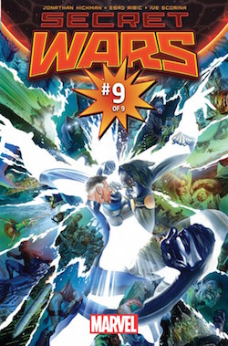
You can't really explain Secret Wars to someone who has no prior experience with Marvel Comics. Here's a rough attempt at describing the premise: Doctor Doom has willed himself to godhood, presiding over a patchwork planet constructed from dozens of alternate universes featuring Marvel's heroes in all sorts of strange combinations — cowboy Captain America, 1990s cartoon X-Men, Thor cops, and so on. On its face, it's just an excuse to dress up the old familiar superheroes in new costumes for a while. But in its execution, Secret Wars read like a Game of Thrones-style saga that investigated the very idea of superhero comics.
Hickman's script is dense and witty and, to someone who has never read a superhero comic before, likely impenetrable. But the impenetrability is a feature, not a bug. Just as TV shows like The Sopranos and Breaking Bad rewarded viewers who watched the whole series from beginning to end, all of Hickman's Marvel work since 2009 has proven itself to be a single text with a beginning, a middle, and a conclusive end.
And so how is the end? It comes together better than I ever would have expected, building to a conclusion that is satisfing and relentlessly optimistic. What Hickman has built in Secret Wars #9 is a superhero comic about the joy and fun of superhero comics, a refutation of decades of relentlessly "realistic" (by which I mean depressing and dark) superhero comics. Rather than destroying legacies and killing characters, Hickman revels in the act of eternal creation. For the never-ending story that is monthly superhero comics, it's a fitting climax.
Ribic proved to be the perfect partner for Hickman's Marvel swan song. His heroes look heroic — even with his painterly style, grown men in spandex don't seem silly at all — and his rendering of Hickman's cosmic concepts feel at once alien and familiar. One page, featuring Mr. Fantastic and Doctor Doom's faces split into dozens of tiny panels and interspersed, mosaic-like, captures the theme of the series: over the course of decades, every superhero and super villain contains multitudes of interpretations and renderings. Those many selves, from the cartoonish 1960s to the realistic 1970s to the gritty 1980s, may seem contradictory and fractured, but if you stand far enough back and take the whole tableau in, you can see that the purity of the original concept still shines through. These are sturdy ideas, Hickman and Ribic are saying, and they will keep spinning out into the future in ways that will surprise us.
Thursday Comics Hangover: The know-it-all
Paul Tobin and Alberto J. Alburquerque’s comic Mystery Girl, now on its second issue, is an absolute delight so far. Here’s the little blurb at the beginning of each book that explains the premise:
Trine Hampstead knows everything. No mystery is too small or too weird for London’s premier sidewalk detective — and she truly knows it all, from your most personal secrets to the details of the deepest, most incredible conspiracies. The only thing Trine doesn’t know is how she knows everything.
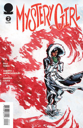
Mystery Girl’s plot is unfolding slowly; Trine is heading to Russia to unravel a complex mystery involving a mammoth, even as her friends are getting mixed up with trouble that involves a creepy hitman.Tobin wisely puts the emphasis on Trine’s characterization in the first two books of the series — her sweetness is as much of a draw as the book’s central mystery at this point.
Alburquerque’s art is reminiscent of comics great Ernie Colón, which is to say he combines a lot of detail with cartoonish faces that display a range of emotions. Occasionally, his anatomy needs work — a chin appears to melt off a character’s face mid-conversation, a woman’s rib cage seems to turn boxy and lumpen — but each of his expressive characters look like unique human beings with inner lives and distinct backgrounds, so I’m inclined to forgive him the rare lapse in anatomical mindfulness.
Mystery Girl feels like a combination of the podcast Mystery Show, the Encyclopedia Brown books, and a Zadie Smith novel. You want to bathe in the world of the book, in part because the scale feels exactly right. Sure, Trine is leaving the relative comfort of her London sidewalk detective business to head to Russia, but the stakes feel relatively modest. Just because Trine knows the solution to every mystery presented to her doesn’t mean that she knows everything. Omniscience does not solve all your problems; sometimes context is what matters most.