Archives of Thursday Comics Hangover
Thursday Comics Hangover: The hilarity of failure
Seattle cartoonist Tom Van Deusen’s newest book, EAT EAT EAT, is the latest entry in a long comics tradition: a humorous book about a feckless loser who doesn’t possess the self-awareness to realize that he is a feckless loser. It’s a somewhat proud (if self-loathing) lineage, stretching to Chris Ware and Ivan Brunetti from R. Crumb and Dan Clowes and on and on and on.
< 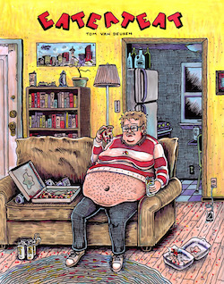
Van Deusen’s portrayal of Van Deusen is entirely at the level of caricature; the cartoon Van Deusen can’t walk past a street food vendor without buying something, even after his date affirms that she’s a vegetarian and she has no interest in eating bad food handed to her by a stranger on a street corner. Then, after the date implodes — the word “m’lady” is involved — Van Deusen tries to join a gym. Things only get worse, and more absurd, from there.
Your taste for this brand of comedy will vary, of course. As someone who read a lot of alternative comics in the 90s, I appreciate what Van Deusen is going for, but I have seen this particular scenario play out in dozens of comics; at this point, the overly pretentious hate-able loser routine feels almost like a nostalgia act. Van Deusen pulls it off really well — he’s undeniably a funny, talented cartoonist — and he invents some new angles on the routine, as when the cartoon Van Deusen “maintain[s] his Facebook angles” on his date, which means he tries to keep his face in the same tortured position as the flattering photo on his Facebook profile as he and his date walk around. It’s an additional, modern humiliation to heap onto the time-honored tradition.
The strips collected in EAT EAT EAT were originally published between 2011 and 2015, and it’s astonishing to watch Van Deusen’s illustration develop and grow over the span of those four years. His early style had a rough charm to it — it was too feathery for my liking — but his later work is developing a nice cartoonish roundness that plays off the prickliness of the writing in a particularly pleasing way. By the end of EAT EAT EAT, the cartoon Van Deusen is just as delusional as ever, but the cartooning Van Deusen leaves the book well-equipped for whatever his next comics challenge may be. I, for one, can’t wait to see what he does next.
Thursday Comics Hangover: Bringing the fire
“It’s a Christmas un-miracle,” Nick at Phoenix Comics announced yesterday as I stared down the empty wall of new releases. Turns out, the Grinch stole New Comics Day this week: the heavy snowfall at Snoqualmie Pass meant that the Diamond Distribution truck carrying all the new comics intended to arrive in Seattle today was stuck on the east side of the mountains. No comics store in the entire Seattle area received any new comics yesterday. (Shipments are expected to arrive today.) It’s enough to make you consider the fact that building an entire industry around one distributor is a bad idea or something.
Since I was out of town last week, I still had some new-to-me comics to pick up. Of those, the one that surprised me the most was Prometheus Eternal, a collaborative publishing project between Locust Moon Press and the Philadelphia Museum of Art.
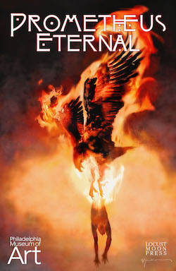
There’s not a clunker in this book. The fiercest complaint you could muster for Prometheus Eternal is that some of the contributions are scanty; the Morrison/Dalrymple collaboration that reimagines Prometheus as a modern superhero is only three pages long, for instance. But those three pages are a doozy: in the first panel a writer stares at an empty screen, her fingers hovering over a keyboard. “I have NO IDEA how to say what I am trying to say,” she says. A man stands in front of a blank canvas, wondering, “What if I never paint again?” The response? “Have no fear! Prometheus is here!” You can probably picture the rest, except Farel Dalrymple is a better artist than whoever draws comics in your imagination.
The stories vary wildly in mood and tone and content. David Mack writes a short open letter to Prometheus. Andrea Tsurumi writes an excellent biographical comic about the creation of Prometheus Bound. Yuko Shimizu contributes a story of a family only loosely tied to the theme. James Comey offers up a very funny gag strip about Prometheus’s eternal torment. Prometheus Eternal is a short book, but it’s short in the always-leave-‘em-wanting-more sense, which should really be the golden rule for all comics anthologies.
This is such a satisfying collection that it will hopefully inspire more of this kind of thing — it would be wonderful to see museums commissioning and publishing comics in response to works in their collections, especially if they could snag contributors of this high caliber. Comics, come to think of it, should really be the preferred medium for art criticism. Prometheus Eternal feels so fresh and so inspired that it should be delivered from a mountaintop in the palm of a demigod. Let’s hope other people do the right thing and crib shamelessly from this example.
Thursday Comics Hangover: Norovirus vs. Mark Millar
Last week, I contracted norovirus. It was terrible, and I’m not going to tell you any more about it except to say that I wound up in bed for 36 hours, feeling awful. I couldn’t watch movies. I couldn’t read poetry or prose. All I could stand to read, all I could focus my attention on for more than a minute at a time, was comic books. This has pretty much always been true for me; whenever I come down with an illness bad enough to send me to bed, I wind up reading comics. I always have a little stash of unread comics lying around for that moment when I get sick and need to get out of my head.
I had bought a used collected edition of Mark Millar’s and Sean Murphy’s comic Chrononauts at University Book Store and added it to my sick stash about a month before the norovirus kicked in. I’m a fan of Murphy’s art — the man can draw anything, from a futuristic pirate civilization in The Wake to religious parody in Punk Rock Jesus — but my feelings for Mark Millar are decidedly more complex. In fact, I think I hate him.
The sad truth about Mark Millar is that almost all of his comics could be pitched as “What if __ were irresponsible?” His comic Kick-Ass is about what would happen if superheroes were a bunch of irresponsible pricks. Civil War and Old Man Logan are about what would happen if every character in the Marvel universe started to act like an asshole. The Ultimates is about the Avengers being egomaniacal monsters. Jupiter’s Circle is about the Superman family of characters acting like the Kardashians. And on and on and on. Not that there’s necessarily anything wrong with this, in theory: virtually any premise could make a good comic, if handled correctly. But Millar’s characters are all the exact same asshole, the kind of insufferable douche who gets drunk at a party and immediately starts bragging about how awesome his life is. If Millar’s parodying something, that parody gets lost in all the obnoxious braggadocio.
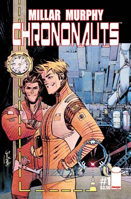
Here is the plot: the time travelers decide to rule the world. “Back home I’ve got nothing, dude” the inventor of the world’s first time-travel device tells his friend. “Here, I’m a king,” he says, and he gestures around his kingdom: there’s a large print of a woman wearing a bikini on the wall, and a few sports cars, and a pool table, and some samurai swords. It’s a 15-year-old boy’s idea of what ruling the world would be like.
Again, maybe this is supposed to be satire. Maybe Millar intends Bill and Ted Meet Tucker Max to be commentary on the empty-headedness of modern men. But satire comes from a moral place, and there’s no real moral judgment at play here. In fact, this book seems to step back on every page and shake the reader by her shoulder and say, “isn’t this totally awesome?” It’s all a set-up for a cross-time chase sequence that lasts several issues and is impeccably illustrated by Murphy. But there are no stakes, no lessons, and no real surprises. It’s just exactly the kind of dick-swinging jackassery that a teenage boy would write, only drawn and packaged professionally.
Every time I read something written by Mark Millar, I feel unclean afterwards. He’s made his fortune by writing directly toward the ugly id of a very particular brand of comics fan, the self-entitled nerd-bros who dominated the industry for decades before women and minorities finally made their voice heard. Millar’s leering adolescent power fantasies feel like the deathbed rattle of an industry that refused change for as long as it possibly could.
Lying there in my sick bed, I couldn’t get Chrononauts out of my head. Those two terrible men who do whatever they want and avoid all repercussions took up residence there in bed with me, fist-pounding and trying to out-brag each other about how cool they are. Chrononauts left me feeling even sicker than I felt before I picked it up. It left me with the realization that even norovirus is preferable to Mark Millar.
Thursday Comics Hangover: Utopian symmetry
In the back pages of the first issue of the new series Symmetry, writer Matt Hawkins admits he’s “gotten a bit sick of” dystopia’s omnipresence, and so he decided to try writing utopian fiction, instead. He read Sir Thomas More’s Utopia (“it’s boring as hell,” Hawkins tells his readers, urging them to “skim it”) and embarked on months of research, determining the four qualities of all utopias in fiction (ambition, creativity, diversity, and instruments of capital must be eliminated) and what he believes to be the four pillars of society (community, peace, harmony, and equality are required). Finally, Symmetry is his story of that utopia.
Hawkins was lucky enough to find an artist in Raffaele Ienco who seems uniquely qualified to draw a utopian vision: his art has a painterly quality that brings both beauty and detail to the surroundings. Each panel of Ienco’s is packed with information: we see gleaming hallways and countless background extras as our protagonist walks around his utopia, while dome-headed robot nannies supervise all the action and ensure that humans don’t cause each other (or themselves) any harm. (One robot snatches a beverage out of the hands of our main character, Michael, saying: “Citizen, excuse me! That drink is not optimized for your nutritional needs. This one is. Labeling error. My apologies, citizen.”) Occasionally, up close, the features of the people in Ienco’s art look too plasticine, but there’s so much information packed into every page that it’s an easy-enough flaw to ignore.
The first issue is entirely devoted to establishing the world. High-level technology renders it almost unrecognizable to us — humans are born asexual, for example, and they choose their own genders and names at age 13. And the reader has to spend most of the issue shaking off those dystopian reading habits. By issue’s end, you keep expecting Michael to turn the corner and find evil robots shoving humans into a giant pie-making device, or making a secret stash of feral humans fight for the robot’s amusement. But that kind of thing doesn’t happen in utopian fiction; the inciting incident for the action pretty much always has to come from outside.
You can’t dwell on the plot of the first issue of Symmetry, because, well, nothing much happens. That’s not really fair; aside from the establishment of a well-considered sci-fi world, two events happen, one of which is a spaceship crash. But it’s hard to say what the consequences of those actions are, exactly — what kind of a plot they’re propelling. It’s interesting to read a book and finish the first issue and know by the end of it that everything has changed, but to not know what that means, or even if we should be happy about it. I wouldn’t want to live in the world of Symmetry, but I sure am glad to visit.
Thursday Comics Hangover: A vision of normalcy
Every once in a while, a truly individual voice will emerge out of the morass of conventional superhero comics. These occasions are always a surprise — nobody could have predicted that Swamp Thing would become a convergence point between art and commercial comics until Alan Moore and Steve Bissette landed on the book, and nobody expected much of Daredevil until Frank Miller was allowed to get experimental with the character. It’s too early to draw a comparison Tom King and Gabriel Hernandez Walta’s The Vision to those two examples, but two issues into the series, it’s already clear that the book is something special.
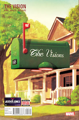
In the first issue, Virginia made a choice to protect her children, and in the second issue she constructs an elaborate fiction to hide the truth of what happened from Vision. The pair sit awkwardly on a couch, dressed like preppy humans in a clothing catalog, and they begin to understand the complexity of married life. “They could hear the stutter and roll of a skateboard riding through their street,” the captions explain….
…the lazy caw of birds yelling in the wind. The bland, passive roar of a 757 cutting into a cloud. These are the noises of their every day, the banal background to their new home. They used to sound so pleasant.
The Vision drops a godlike, aloof figure into the American suburbs of John Cheever, but it’s not interested in easy satire. Instead, it deals with the discomfort of what happens when you finally get everything you ever wanted, and the vertiginous moment when you realize that life just keeps going after you achieve your dreams.
Gabriel Hernandez Walta’s art perfectly resonates with the hollow echo accentuated in King’s script. He’s not interested in making the Vision and his family look human, but they’re not superhero-idealized, either. Instead, they look like they’re trying to behave like humans. They move with a kind of uncomfortable emulation, except for the moments when they take to the skies. When they fly, they’re graceful and lean. It’s one of the few times they’re not trying to pass for normal.
We’re only on the second issue of The Vision, which means things could yet go totally wrong. But the first issue ended with one of the darkest twists I’ve read in a Marvel comic, and the second issue is cloaked in an appealing sense of impending doom. You get the sense as a reader that if King and Walta are allowed to make future issues of The Vision as uncomfortable and full of yearning and quiet moments as these first two issues, you could be watching the start of something truly memorable.
Friday Comics Hangover: The Dark Knight, reheated
By far, the most-hyped comics release of the week is DK III: The Master Race, the third volume in Frank Miller’s Dark Knight series. Ostensibly co-written by Brian Azzarello, the actual authorship of DK III is in question — Frank Miller has basically admitted that he’s not been involved in the writing of the series. Whoever actually wrote the story, Miller certainly didn’t draw the book; the art is by Andy Kubert, with inking by Dark Knight veteran Klaus Janson. So we have a sequel to a much-maligned sequel to one of the all-time classic Batman stories, written-but-probably not-at-all-written by the original writer and drawn by a different artist. How is it?
Well, it feels like fan fiction. But it doesn’t even feel like Dark Knight fan fiction; it feels like DK II fan fiction. For those of you who have better things to do, the sequel to The Dark Knight Returns, DK II, is pretty roundly regarded as a failure. Marred by atrocious computer coloring and written in a completely different tone than the original Dark Knight series, DK II was a more cartoonish take on the future of the DC Comics canon, including a Batman who was actually — gasp! — having fun. Some contrarians still defend DK II for being a cheeky dissection of the idea of superhero comics. I can understand that defense, but I disagree: the problem with DK II was that it was bad comics. Miller’s satire, never very subtle, took on the form and grace of a cement block. The jokes felt private and insular, the worldview felt increasingly mean-spirited as the book went on, and the entertainment value was erratic. (At times, the book did express a sort of madcap thrill; I might be remembering this wrong, but I’m pretty sure Miller processed 9/11, which happened between issues two and three of the series, in the comics as a giant cartoon frog demolishing a city.)
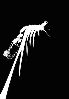
I’ve never been a fan of Andy Kubert’s artwork. He’s a second-generation comics artist (his father is the legendary Joe Kubert), and his illustration style has the soulless ache of someone who never bothered to learn how to draw anything other than comics. His composition is boring, his figures are thick, and the Milleresque tiny panels on every page only serve to make his art look even sillier by comparison. He has never drawn an interesting page in his life; they’re all awkward grimaces and poses, with not one bit of a recognizable reality on the page.
The only fun part of the first issue of DK III is the enclosed mini-comic starring The Atom, illustrated by Miller and Klaus Janson. It’s tipped into a cardboard leaflet in the center of the book, and it begins with The Atom fighting a dinosaur and reflecting on his divorce, and how aging has mellowed him as a man. This is the kind of fun, weird stuff that people who praise DK II are looking for in their books, and the format feels novel and interesting. Unfortunately, the comic stops short when a plot thread from the main book intrudes on the story, making it a glorified post-credits scene in a Marvel movie: something entertaining, followed by a teaser that pushes the story forward into the next installment. Who cares?
A few years ago, DC Comics tried to mine the Alan Moore/David Gibbons comic Watchmen in a series of prequels. Before Watchmen was presented as a prestige project, and it included a number of big-name comics creators including Azzarello and Kubert. The comics were, for the most part, technically excellent. But they simply didn’t matter. The books were released and collected and rereleased in book form, and nobody gave a shit and they were immediately forgotten. Unless something transformative happens in the next few issues, DK III will suffer the same fate.
Thursday Comics Hangover: Super women
In what could very possibly be some sort of a record, Marvel Comics this week published three first issues of three different series starring superheroes who are women. Even better, all three of them are great fun. They’re classic superhero comics; compelling stories about conflicted characters in outlandish situations.
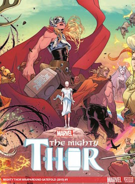
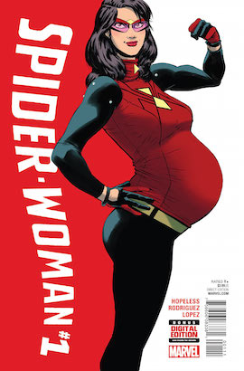
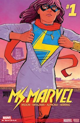
If you follow superhero comics, all three of these issues are worth your time. Perhaps most importantly, they’re not just comics about superheroes that have been gender-swapped; they’re comics about women with superhuman abilities, which presents a different palette than the standard male-oriented superhero comics. But while Marvel should be commended for producing so many new series starring female characters, the mastheads on these books identify that Marvel has not done as well with gender parity behind the scenes. Of the three writers and four artists on these issues, only one — Wilson — is a woman. Representation on the page is so important, but the comics industry has a long way to go before the creators are as diverse as the heroes they’re paid to create.
Thursday Comics Hangover: The preacher's curse
The nerd internet got very excited a few weeks ago when the first trailer for the Preacher TV series was posted to YouTube. The trailer, to me, looked like a lot of hand-waving with very little substance, but then I’ve got conflicted feelings about Preacher. When I was a teenager, it was my favorite comic, a huge epic story — let’s be honest, a superhero story — about good and evil and, most importantly, sacrilege.
I haven’t read Preacher in years, in part because I fear it has probably aged very badly. Even though it launched in the mid-90s, Preacher likely now reads like something from a long-ago era, since it's packed with gay panic jokes and sexism. Those were never the appeal for me; I was there for the fun of a comic which casts the Christian depiction of God as the villain. For a lifelong atheist, it was a real thrill. Maybe Preacher’s transgressive nature meant that it would never age well. It’s impossible, after all, to be permanently transgressive; if you seek to offend, shifting cultural norms mean that you will most likely not be able to offend the next generation — at least in the way you originally intended.
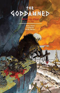
The book begins “1600 years after Eden,” with a nameless figure waking up after being brutally assaulted. He then wanders the desert, completely naked, in search of the people — or, in this case, the giants — who beat him up. Captions deliver his narration to us: “I have walked this pile of shit we call a world for 1600 years. I have cursed God every way he can be cursed, including to his face.”
We eventually do discover our protagonist’s name, and it reveals him as a famous Biblical figure. At the end of the book, we’re introduced to an antagonist who also is a Biblical figure. The pacing, with the villain identifying himself on the very last page, is very much of a superhero comic, but The Goddamned seems desperate to label itself for mature readers. It’s got bad language and nudity and violence and, I guess, “adult subject matter.”
The Goddamned didn’t work for me, in part because I felt as though its edgy Bible riff might age as poorly as Preacher has. How many different ways can comics writers ostentatiously raise their middle fingers to the heavens? The first issue of The Goddamned is all attitude and posing, with no real sign that there’s anything substantial happening in the background. Maybe future issues will pay out in surprising ways. That’s entirely possible; Aaron certainly has the capacity to tell a good story.
If there’s a reason to pick up The Goddamned, it’s Guéra’s art. This is the kind of hyperdetailed style that Americans used to describe, with a certain kind of longing, as “European.” A double-page spread of the marauding giant hordes is so full of debauchery and sin that it’s like a Where’s Waldo of monstrosity. During the eight-page, mostly silent fight scene in the middle of the book, (another reminder of superhero comics) Guéra ilustrates violent acts with economy and gravity; you can always tell what’s going on in every panel, and he doesn’t allow the action to overwhelm the page. He keeps the panel count high, rather than blowing the fight scene out into a too-extravagant series of splash pages. His art, it must be said, is almost too good for the comic in which it appears.
Thursday Comics Hangover: The weird dawn light of Paper Girls
We're in a golden age of Brian K. Vaughan comics. I can't shut up about how good Saga is; he recently wrapped up The Private Eye, a beautiful sci-fi comic with Marcos Martin; his Canadian future war comic We Stand On Guard keeps getting better; and his newest series, the retro sci-fi adventure comic Paper Girls, is probably his best non-Saga comics work yet. Co-created with artist Cliff Chiang, Paper Girls tells the story of a group of newspaper delivery girls in 1988. One day, they encounter some monsters. The audience is introduced to an object that suggests time travel might be involved. The second issue, released yesterday, adds to the mystery by tossing in some more monsters and a very confused adult.
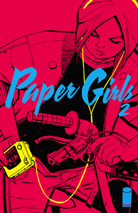
Paper Girls is reminiscent of the J.J. Abrams movie Super 8 in that it's a genre story that's soaked in nostalgia for 1980s childhoods. But while Super 8 collapsed under its own weird self-regard — did the world really need a Spielberg homage produced by Stephen Spielberg? — Paper Girls hums along by keeping the postmodern winks to a minimum. Sure, the characters argue about pop culture; when one character calls Peggy Sue Got Married a sci-fi movie, another delivery girl can't resist a little fannish pedantry: "That's actually more of a fantasy time travel story," she says. But this meta-commentary feels appropriate for the story and not at all forced.
Fresh off a career-making turn on Wonder Woman, Chiang proves to be exceptionally suited for a comic like Paper Girls. The girls are realistic teenagers (hooray for a complete lack of creepy objectification!) and the monsters are happily comic-booky. Chiang's genius, though, is that these disparate elements somehow obviously exist in the same universe; they each have equal weight. From the mundanity of an abandoned Big Wheel on a street corner to the bizarre vision of a werewolf in a Guns N Roses t-shirt stagering around, Chiang keeps everything tight and consistent.
Paper Girls also stands as a representative example of what good coloring can do for a comic. Matt Wilson uses an 80s-appropriate neon palette for the covers and special effects, but most of the book takes place at an eerie moment of dawn — or is it dusk? — when the sky is a washed-out rainbow of deep purples and royal pinks. Anyone who has ever run a paper route remembers the eerieness of waking up at pre-dawn when the whole world is asleep; Wilson captures the glow of that moment on paper and makes it real.
It's unclear at this point exactly where Paper Girls is going, though it's obvious that Vaughan has a plan in mind. It could become a full-on creature feature, or it might be a twisty time-travel story, or it might be a tribute to the friendship between girls. Knowing Vaughan, it'll likely be some combination of all three. Whatever happens, I'm entirely onboard; Paper Girls has rocketed to the top of my list of must-read books.
Thursday Comics Hangover: Mona Lisa, smile
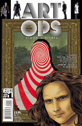
Art Ops begins with a premise that seems charming enough, if a little bit limited: a special team of operatives have the power to literally bring art to life. They pull the Mona Lisa from her frame because some mysterious, malevolent force is coming for her, and they put her into a kind of Art Witness Protection Program. Elsewhere in the issue, graffiti walks off the walls and attacks a few New Yorkers. Banksy even makes a(n off-panel) appearance. It’s a good high concept, but how many famous paintings can you screw around with before the idea loses its thrill?
Luckily, there’s a whole lot more going on in Art Ops. It feels as though Simon and Allred have constructed many layers to the world, adding a bruised family dynamic and a wide cast of characters. It’s basically a superhero story — one character’s right arm is made out of art, another character wears a black jumpsuit and flies around — but the narrative hints at a moral complexity that’s lurking off to the edges of the story.
Mike Allred is the best character designer in mainstream comics today. Each player in Art Ops has their own look and feel, and his pop realism is perfect for incorporating all the little art history jokes into the background throughout the issue. Allred’s Jack Kirbyesque energy is perfect for a premise like this: he doesn’t get too wrapped up in emulating, say, Da Vinci’s rendering. Instead, he gives us Allred’s version of Mona Lisa and Allred’s cover of Lichtenstein. This is less about mimicking and more about interpretation; only an artist with Allred’s confidence could pull that trick off.
We don’t learn what the antagonists of Art Ops are up to in this first issue; in fact, we don’t even see who the antagonists of Art Ops are. The protagonist is a little bit of a dick, and the story does rely on that oldest motivational trope, the death of a girlfriend, to get the action going. But it’s a lively, ambitious, layered first issue that hints at a bigger payoff in issues ahead. I’ve read a lot of bad first issues lately; Art Ops is the first one I’ve come across in a few weeks that suggests the journey will be worth the investment.
Thursday Comics Hangover: Ants and giants win a miserable week
Maybe I was just in a bad mood or something, but I didn't find much enjoyment in the comics I bought yesterday. The new issue of Godzilla in Hell is a total bust — a real downer of a serious, clunky monster comic after last issue’s greatness. The 28th issue of Astro City continues a depressing trend with that series; what began as commentary on superheroes has basically become a boring superhero anthology comic. Warren Ellis’s first issue of Karnak feels like the same mainstream Warren Ellis we’ve seen a million times before: some edgy torture and a few lines of absurd, self-aware dialogue. The art by Gerardo Zaffino looks pretty cool at first, until some action happens and you realize you can’t tell what the hell is going on. (If you can explain what Karnak does to the bullet that’s fired at him in a scene late in the book, I’d love to hear it. All Zaffino drew was a blurry finger and some speed lines. I have no idea what was supposed to have happened there.)
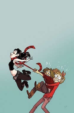
Luckily, my week was saved by the seventh issue of John Allison and Max Sarin’s Giant Days. Every issue of this comic, about three young women becoming fast friends at college, is better than the one before. You don’t have to have read the rest of the series to understand what’s going on in this issue: Esther took a class on the New Testament as a joke, but now she’s in danger of failing; Susan has engaged in a torrid, secret love affair that finds her buying condoms three boxes at a time; and Daisy is busy worrying about everyone else all the time. Allison’s script is simple and funny and character-based. Sarin’s art is cartoony and expressionistic. It’s the most enjoyable comic of the week, and the only clear-cut win in a week full of disappointments. All the bluster and sameness of the new books this week felt like silly kids' stuff when compared to this humor comic about life in college. It's sure to be a high point in your week, too.
Thursday Comics Hangover: The end of Ms. Marvel
(Every comics fan knows that Wednesday is new comics day, the glorious time of the week when brand-new comics arrive at shops around the country. Thursday Comics Hangover is a weekly column reviewing some of the books I pick up at Phoenix Comics and Games, my friendly neighborhood comic book store.)
The world ends in superhero comics all the time. DC Comics published a company-wide crossover called Final Night almost twenty years ago in which superheroes and their supporting casts believed their worlds were about to end for real (no, for really real this time). This summer, Marvel Comics did basically the same thing as part of their big crossover, Secret Wars. They published “last issues” of their comics under the banner “Last Days Of…” with the premise that the world is about to end for real (no, for really real this time) and so their characters are forced to come to peace with the idea that they are powerless to stop the destruction of the universe. Like most of the Secret Wars crossover, the idea started strong but has gone on for way too long.
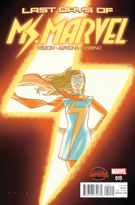
Ms. Marvel has always been a dance between outrageous superhero adventure and the soap-operatic story of Kamala Khan, a teenage Pakistani-American Muslim growing up in Jersey City. The standard superhero tropes are all at play — can Khan keep her superhero life a secret from her hyper-conservative parents? — but Wilson’s low-key script and Alphona’s cartoony art kept the stakes at a happily human scale. Marvel Comics hasn’t debuted a superhero this promising in decades.
But that’s all old news. Yesterday, Marvel “ended” the series, and Wilson and Alphona took the opportunity to write a real, honest-to-goodness last issue for Ms. Marvel. As good as the series has been, this last issue is even better. Though she knows the world is ending, Khan doesn’t turn into Ms.Marvel,or use her shape-shifting powers even once in the issue. Instead, she has heartfelt conversations with her mother, with a friends, with other members of her supporting cast. These conversations, all of which take place in or around a high school in which residents of Khan’s Jersey City neighborhood are taking shelter from the apocalypse, are alternately touching, awkward, and earnest.
Relying as it does on dialogue crammed into a series of tiny bubbles, it’s surprising that this issue works as well as it does. Wilson is gifted at the haiku of comics scripting — seriously, count the number of words in a given comics issue and you’ll have a better appreciation of how hard it is to write dialogue for the medium — and Alphona does the rest of the work with his characters’ emotive faces and expressive body language. They’ve grown as a team over the two years that they’ve worked on the book, and this issue is the payoff for all that hard work. Rather than going out with a silly fight or existential angst, Ms. Marvel instead faces the end of the world as a human being.
Look, we all know it’s comics, and that Ms. Marvel is a popular book, and that nobody’s going to disappear forever. But the trick that Wilson and Alphona pull off in this issue is they take an overplayed gimmick and they use it as an opportunity to allow the characters to speak their minds and open their hearts and demonstrate how they’ve changed since we’ve first met them. This is a hell of an accomplishment: it’s an ending that leaves you desperate to read the next chapter.
Thursday Comics Hangover: Refreshing and cool
I couldn't make it to the comic book store last night because I was too busy celebrating at the launch party for California Four O'Clock, the debut novel from Seattle Review of Books co-founder Martin McClellan. It was a big new comics Wednesday to miss; a ton of Marvel Comics relaunched yesterday with all-new first issues and status quos, including Spider-Man, Iron Man, and Doctor Strange. Of those three, the only one that I'm at all interested in is Doctor Strange; writer Jason Aaron is often pretty good, and artist Chris Bachalo's noodly illustrations seem perfect for the baroqueness of the character as created by Steve Ditko. Spider-Man has been devalued in recent years by too many iterations of the same character — Marvel Comics will soon be publishing a ongoing comic book starring Spider-Men (and -Women) from across multiple dimensions, watering the brand down even further — and Iron Man is now written by Brian Michael Bendis, who has stretched himself way too thin in recent years.
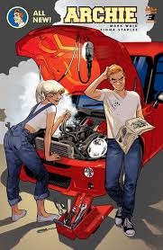
The third issue of Archie reintroduces the relationships between these characters in new and interesting ways, twisting the love triangle inside out. Archie is following new-to-town rich girl Veronica Lodge around like a hungry puppy, Jughead is trying to figure out what the hell is going on, and Betty is upset about the mysterious event that led to her breakup with Archie. It's packed with interesting characterization. Jughead is portrayed as ridiculously wise, with a keen sense of focus that grants him almost mystical properties. Veronica demonstrates great vulnerability at just the moment when we expect her to become a super-villain. Betty is so profoundly decent that the reader can't help but land on her side. Only Archie lacks a distinctive personality here; he may be the front man of this particular band, but he's doomed to only react to things happening around him. He's such a straight man you could use him as a ruler in a pinch.
The biggest potential problem with this version of Archie is that Fiona Staples has not signed on as an artist for the long haul. This is a visually dynamic comic that rewards re-reading. The characters' body language is vivacious and evocative. The fashions are fun — clothing hangs on bodies realistically — and the big, moony eyes of our main characters seem full of aspiration and disappointment and, you know, life. In three short issues, Archie has transformed from a smart retooling of an ancient brand into the best high-school comic on the stands today. Marvel Comics should be taking notes: this is how you refresh an old idea.
Thursday Comics Hangover: Godzilla goes to hell
Most licensed comics, let’s be honest, are terrible. Comics as merchandising spin-offs are usually afterthoughts, completely irrelevant to the movie or TV show that spawned them. Nothing happens in licensed comics, and somehow the approval of a fleet of corporate lawyers makes the officially licensed spin-offs feel even more like bad fan-fiction. They’re safe and boring and bland.
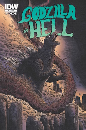
The first issue of Godzilla in Hell, illustrated by rising indie star James Stokoe, was so simplistic that it was almost too slight. In a wordless comic, Godzilla fell into Hell and then fought his way around. Only Stokoe’s noodly, effervescent art kept the issue from being a pantomime bore; you could stare at the whorls of fire and brimstone that Stokoe layered into the back of every panel for hours. The second issue, by Bob Eggleton, was a bit more traditional for a Godzilla comic: giant monster fights overlaid with some overwrought narration.
The third issue of Godzilla in Hell, written by Ulises Farinas and Erick Frietas with art by Buster Moody, is a nice blend of the two issues that came before. Godzilla wanders around hell and fights Space Godzilla, but he also encounters a hive of angel-Mothra hybrids that try to trick him to do their bidding. Christian imagery is everywhere — at one point, Space Godzilla shatters a hellish replica of Rio’s Christ the Redeemer statue with a force bolt — and then Godzilla stares at a giant purple mountain made out of angry eyes that tries to hypnotize the giant lizard. “SUBMIT, SERVE PEACE SUBMIT, SERVE PEACE SUBMIT, SERVE PEACE” the eyes chant at Godzilla, whose scowl gives away the fact that he’s not having any of it.
Godzilla in Hell is one of those batshit ideas that offers no clue as to how it came to be. Was it really just as simple as someone watching a creature feature and thinking, “I wonder what would happen if Godzilla starred in Dante’s Inferno?” Because if so, that person deserves a medal. So far, Godzilla has not squared off against Satan himself. If the series ends without that showdown, I will be very disappointed. And if the quality holds up, I’m hoping for some sequels. Godzilla in Heaven, perhaps? Godzilla Vs. God? Godzilla starring in Paradise Lost? Why not? The lawyers don’t seem to be watching, so we might as well have some fun.
Thursday Comics Hangover: Nameless finally gets off to a strong start
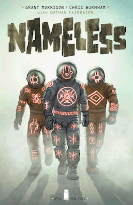
It’s a pity that Nameless didn’t start off very well. The story opened in media res, with a nameless dabbler in the supernatural — well, to be specific, his name is Nameless — being recruited to fend off the asteroid Xibalba. The quick start perhaps wouldn’t have been as big of a problem if Morrison weren’t in his hyper-frustrating opaque mode, refusing to offer much by way of explanation for anything on the page. (Everyone knows too much exposition is a bad thing, especially in comics, but sometimes Morrison’s scripts practically throb for more explanation.)
But over the next four issues, as Morrison’s intent became more and more clear, Nameless became more and more interesting. The threat evolved into something imposing, the blending of astronauts and mysticism was explored in a little more depth, and the reader was granted enough understanding to care why everyone was doing what they were doing. This is a monthly comic that will improve drastically when it is all bound between two covers in trade paperback form.
One aspect of Nameless that is beyond complaint is Chris Burnham’s art. Burnham is one of those hyper-detailed cartoonists like Geoff Darrow or Frank Quitely, the sort of artist who can draw a complex facial expression in just a few feathery lines but then spends seemingly weeks fastidiously rendering every single water spot on the chrome of the kitchen sink in the background of the panel. That blend of cartoonishness and realism works especially well for a horror series; the familiarity of a simplistic cartoon face lulls the reader into complacency, even as a monstrous betentacled demon blossoms open behind the face, with every single vein in the creature’s eye fastidiously rendered. On a visceral level, this screams something-is-wrong into the reader’s face. It’s intrinsically unsettling.
Nathan Fairbairn’s coloring, too, is exceptional. He aspires to realism in some of the scenes — a few pages in issue 5, when a group of people wander into a spooky mansion, are glowing with gentle candlelight and the warmth of burnished wood — but then a few pages later he unleashes a full-page gaudy psychedelic tableau on the reader, an explosion of turquoise and lavender and vivid, toxic red.
Nameless issue 5 is where the whole series comes together. It tells more of Nameless’s story, explaining why he was in such dire straits at the start of issue number 1. On reading this issue, with its gore and melodrama and Lovecraftian pastiche, I was left wondering why Morrison didn’t start the series off here. With a concept like this, Morrison could’ve afforded to take his time and develop the threat a little more cautiously, starting as a “normal” paranormal comic and then building to the mystic astronaut angle. Perhaps when the miniseries is done and we can see the full canvas of Morrison’s story, this decision will make sense, but for now it reeks of a squandered opportunity.
Thursday Comics Hangover: Hey, kids! Head Lopper!
(Every comics fan knows that Wednesday is new comics day, the glorious time of the week when brand-new comics arrive at shops around the country. Thursday Comics Hangover is a weekly column reviewing some of the books I pick up at Phoenix Comics and Games, my friendly neighborhood comic book store.)
In nerd vernacular, the phrase “Hey, kids! Comics!” has taken on a couple of disparate meanings. It originated as a sign on the top of drugstore comics spinner racks (some iterations of the sign were paired with another sign that read “Wholesome entertaining comics”). The phrase has an earnestness to it that’s highly appealing, but it also smacks of a kind of charming hucksterism, not unlike the persona that Stan Lee would develop in early Marvel Comics letters pages.
Over time, though, the phrase has taken on a distinctly ironic flavoring. You’ll now most frequently find the phrase “Hey kids! Comics!” in comments sections, where fans will use it to mock too-gory or overly serious superhero comics. The first time I started seeing it with any frequency was around the time that writer Geoff Johns rose to ascendancy at DC Comics. Johns had a tendency to write comics in which B-list superheroes had their limbs torn off by villains, which annoyed people who liked to read comics to forget about things like violent dismemberment.
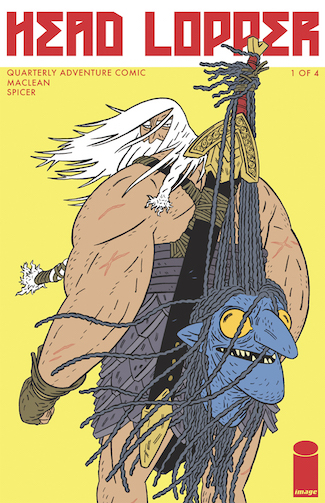
But the whole time I was reading the first issue of Andrew MacLean’s new self-described “Quarterly Adventure Comic” Head Lopper, the phrase “Hey, kids! Comics!” kept reverberating around my head like a pop song. Not in a bad way, mind you. The truth is, Head Lopper is the kind of comic that reminds me why I fell in love with comics in the first place. The action is too ridiculous for any movie CGI to convincingly capture and the premise is so cartoonishly simple — in ancient times, a large man with a sword travels around lopping heads off of people and creatures in exchange for money — that it allows a whole lot of artfulness to sneak in around the edges.
Here’s the story: Head Lopper (who is also known alternately as “Son of the Minotaur” or “The Executioner” or, as he prefers to be called, “Norgal”) has just lopped the head off a monstrous leviathan. Now he’s trying to collect payment for the deed. He’s double-crossed, of course, and so then he heads out in search of vengeance. Oh, and for some reason he has to carry around a severed witch’s head that won’t stop talking. (She shouts at Head Lopper early on, “Check your squinty eyes, oaf! I see, I hear, by Alba, I move!”) Head Lopper is a man of few words, a gigantic overstuffed couch of a barbarian, and so sometimes his tolerance for chit-chat flags.
Really, that’s about it. Head Lopper is just a story about a man who does a very specialized task — again, if you forgot already, he lops the heads off of his enemies — and happens to be very good at it. It’s a fantasy comic in much the same way that, say, Mike Mignola’s Hellboy is a fantasy comic. Head Lopper is not so much interested in deep Tolkien-ish world-building as it is in fun artistic challenges.
Most artists doing mainstream superhero comics should study these fight scenes; MacLean’s simplistic animation-style drawing is wonderfully fluid, and so a scene in which, say, Head Lopper fights a giant wolf, is easy to follow and it conveys a lot of information in an economical fashion. You can follow every step and slash that Head Lopper makes with his giant sword as he hops around the wolf’s enormous body, leaving strategic slices in his wake.
Many pages of Head Lopper pass by without dialogue, but MacLean crams his panels full of so much detail — the masonry of a child-king’s throne room, a stack of firewood piled up next to the front door of a home — that you can’t just mindlessly flip through the comic. There’s a lot going on under the surface of this silly story about a man who wanders around and fights monsters.
In the back pages of Head Lopper, MacLean explains why the book is coming out in huge hunks of fifty or sixty pages on a quarterly basis:
Here’s what I want in every issue of Head Lopper: long fights, dark jokes, creepy atmosphere, short plots and long plots, and comfortable conclusions that, hopefully, still leave you wanting more. The standard comic length would make me cut something short.
I agree; I wish more artists would experiment with this format. Head Lopper feels less like a brief installment in a larger story and more like a short novella that dips into a pre-existing fantasy world. It’s substantial and experimental and fun. In other words: Hey, kids! Comics!
Thursday Comics Hangover: The fantastic voyage from Saga to Bitch Planet
Every comics fan knows Wednesday is new comics day, the glorious time of the week when brand-new comics arrive at shops around the country. Thursday Comics Hangover is a weekly column reviewing some of the new books that I pick up at Phoenix Comics and Games, my friendly neighborhood comic book store.
The comics industry is always wringing its collective hands, trying to figure out how to get more people to read comics. We're at a point where many of the top ten most successful movies of any given year are superhero films, but Marvel and DC can't seem to turn those movie superhero fans into comic book fans. The Walking Dead comics series sells well, but most comics store employees say that Walking Dead fans tend to stick with the Walking Dead comics. They don't venture into other titles.
This isn't the case, I've been told, with Saga. Turns out, Saga readers also read Sex Criminals and Wicked and the Divine. They branch out and try new comics. Why is that? Damned if I know. Maybe part of it is because Saga is such an expansive comic; it feels like a story that's always opening up to embrace new possibilities, which perhaps encourages readers, in turn, to embrace their own new possibilities. Or maybe that's some mystical hoo-ha BS and there's no good explanation.
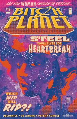
In any case, yesterday also saw the release of the fifth issue of Kelly Sue DeConnick and Valentine De Landro's Bitch Planet, and, goddamnit, Saga fans had better be picking this series up. Bitch Planet takes a simple premise — a women's prison in space — and simultaneously embraces and refutes all the expectations that come along with the premise. Part of the pleasure of Bitch Planet is that it wallows in about nine pulp traditions at once: it's a crime comic and a prison comic and a sci-fi comic and a woman-on-the-edge comic and more, all blended into one dreamy package. Hell, this issue is a sports comic and I still liked it — speaking as the most sports-phobic person in the world, that's really saying something. And this issue has got a great guest essay by Lindy West in the back. What's not to love? The first collected edition of Bitch Planet arrives in early October; when that happens, you have no excuse for missing out.
Thursday Comics Hangover: Raise the Minimum Wage
Every comics fan knows Wednesday is new comics day, the glorious time of the week when brand-new comics arrive at shops around the country. Thursday Comics Hangover is a weekly column reviewing some of the new books that I pick up at Phoenix Comics and Games, my friendly neighborhood comic book store.
Bob Fingerman’s Minimum Wage comics, published by Fantagraphics, were most definitely products of the 1990s. The main character, Rob, dressed in 90s bike messenger chic — mostly black clothing, a wallet chain, chunky boots, some chin hair, a propensity to wear shorts a little too often. He’d blend right in at a Fugazi concert. And though he seemed to consider himself to be an open-minded modern man, Rob’s relationship toward women — especially his girlfriend, Sylvia — was most definitely of the 1990s, too. This was back in the days when Camille Paglia was briefly the world’s most famous feminist, when feminism meant talking openly about the kind of porn you were into, and women were still encouraged to find empowerment by “controlling” the male gaze.
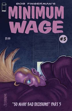
Last year, Fingerman revived Minimum Wage at Image Comics — he also collected the entire original series in an oversized hardcover titled Maximum Minimum Wage — and the new title is very clearly a sequel to the original work. Rob and Sylvia have divorced, and it was apparently a very ugly split; Sylvia only appears in the first revived series as a featured character in Rob’s frequent nightmares. Rob is trying to enjoy being single again, but none of the relationships he seeks out are right for him. He’s enjoying commercial and artistic success, drawing both corporate and semi-autobiographical comics to mostly positive reviews, but he’s also squirming in his skin; nothing turned out as he wanted, and he’s uncomfortable with how uncomfortable that makes him.
Fingerman smartly doesn’t pick the new Minimum Wage up where the old series left off. He’s not afraid to let time have its way with his art. This is most obvious in Fingerman’s illustration, which in the first series was rounded and clean and almost Disneyesque in its voluptuousness. The lines of the new Minimum Wage are noodlier, scratchy, and in some ways uglier. Fingerman still packs tons of rewarding detail into every panel (background characters in restaurant scenes have their own distinct body language, even if they only show up for three panels before disappearing from the book forever) but he’s less prone to care about how realistic things are. (The spray of hair on top of Rob’s head used to be a little Charlie Brown-style curlicue, but in the new series it’s a roosterlike geyser rocketing up from the top of his skull, nearly adding another foot to his height.) The art has become more mature, more concerned with what truly matters, rather than what looks impressive.
Too bad Rob hasn’t grown with Fingerman’s art. Rob’s story in the new Minimum Wage seems to follow one pattern played out over and over again: Rob gets something he wants — a beautiful woman who loves sex as much as he does, an artistic gig that’s fulfilling — and then spends page after page feeling bad about himself. In the latest issue of the comic, #5, Rob wonders to himself, “am I a creep?” It’s probably the closest he’s come to a moment of true self-awareness since we were reintroduced to him last year.
The thing is, in this new Minimum Wage series, we really miss Sylvia. Though the comic has always come from Rob’s perspective, spending this much time in Rob’s head without another regular character to pull him out of his interiority reveals exactly how unpleasant a character he can be. That’s kind of the point; the life of a young freshly divorced man isn’t likely to be a happy one. But it’s hard to imagine new readers clambering on board Minimum Wage at this late date and finding a whole lot to identify with in Rob. This is a comic about alienation, and reading it can be an alienating experience. That’s part of the design; Fingerman knows exactly what kind of a story he’s telling.
Or aspiring to tell, as the case may be: Yesterday, Fingerman told Bleeding Cool in an interview that he has one more series in mind for Minimum Wage, but that sales on the comic don’t justify the continuation of the series. He’d like to complete Rob’s story in either serialized comics or in the form of an original trade paperback, but he might not be able to conclude the comic at all.
That would be a shame; imagine if Woody Allen lost funding for Annie Hall three-quarters of the way through production. Minimum Wage can be a frustrating comic, and the first half of the story now feels like an exercise in 90s nostalgia. But no other comic I can think of is documenting this kind of a quiet life in flux, and very few other cartoonists are putting as much work into every page on a monthly basis. Minimum Wage is worth preserving.
Thursday Comics Hangover: Strong women everywhere
Every comics fan knows Wednesday is new comics day, the glorious time of the week when brand-new comics arrive at shops around the country. Thursday Comics Hangover is a weekly column reviewing some of the new books that I pick up at Phoenix Comics and Games, my friendly neighborhood comic book store.
(Before we get started with the column this week, I just heard about this neat thing and I want to share it with you: The Ladies Comic Book Club, which is a comics book club for women, will be having their third meeting at Phoenix Comics tonight. They’ll be discussing the first two paperbacks of the rock-and-roll-and-magic series The Wicked and the Divine. If you’re a woman and you read comics, you should maybe join this Facebook group, because it’s a super-cool idea and I’m glad someone is doing it. Anyway. On with the show.)
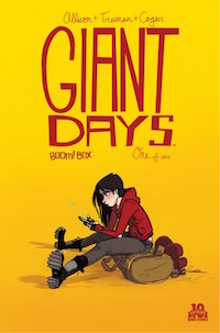
This was a really wonderful week for new comics. Yesterday, I picked up second issues of the incredibly good anthology comic Island, the new Archie series from Fiona Staples and Mark Waid, and Ales Kot and Matt Taylor’s Wolf, as well as a new issue of Stray Bullets and the halfway point of the 12-issue limited series Giant Days, a vastly under-appreciated comic about young women in college.
But I also finally got my hands on a copy of Bloody Pussy, a locally produced self-described “feminist rag,” and even on this standout of a week, it’s a standout. We’ll hopefully be running an in-depth review soon, but briefly: Pussy is a free one-shot tabloid newspaper packed with 12 single-page comics about women’s sexuality and bodily fluids and other topics that are usually labeled too unpleasant for polite conversation.
This is not a paper that wants to win you over; it wants to talk frankly about placentas and assholes and eye-gouging and Don Draper and other important things. It feels like the kind of spontaneous in-your-face creative endeavor that you imagine used to appear on the streets of Seattle all the time back in the Riot Grrrl days. Unless you’re an easily offended doofus, you should go track down a copy of Bloody Pussy immediately. This is the kind of brash artistic statement that will take on the stuff of legend in Northwest cartooning.
Thursday Comics Hangover: Skin deep
(Every comics fan knows that Wednesday is new comics day, the glorious time of the week when brand-new comics arrive at shops around the country. Thursday Comics Hangover is a weekly column reviewing some of the books I pick up at Phoenix Comics and Games, my friendly neighborhood comic book store.)
First issues of comic series are tough. You have to establish a premise, introduce readers to at least one character to care about, and then give the readers a good reason to come back for the second issue. It’s like trying to run in place on a rolling log — one misstep and you’re pudding. You might have an incredible idea for a comic series, but if your first issue isn’t compelling it’s very unlikely that your story will ever find the audience it deserves. It’s not fair — imagine the pressure novelists would feel if browsers could lease a novel’s first chapter, with an option to buy the rest of the book — but fairness and the creation of art never get along very well.
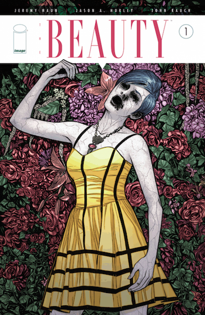
You can probably tell from that introduction how I feel about The Beauty, the new comic series written by Jeremy Haun and illustrated by Jason A. Hurley. In theory, it’s a catchy little introduction to a sci-fi premise.The captions on the first page lay out the concept over shots of large groups of (mostly white) pedestrians walking by on a city street:
Two years ago, a new sexually transmitted disease took the world by storm. This S.T.D. was unlike any other that had come before. This was a disease that people actually wanted. “Victims” of this epidemic were physically changed by the virus. Fat melted away, thinning hair returned, skin blemishes faded, and their facial features slimmed. It became known as The Beauty.”
Okay. I mean, it’s certainly all right there. (I could do without the cliche “by storm” in the very first sentence of the book, but let’s be generous and ignore that for a moment.) The high concept has a bunch of obvious questions attached. Beauty is subjective, so why does everyone look like a model? And what about other races — are they held to a caucasian beauty standard, too? (The cast seems to be all-white, except for two minority background characters reduced to a couple lines each.) Obviously, you can’t touch on all these subjects in a couple dozen pages of comics, but there’s very little depth in the first issue of The Beauty to convince me that Haun and Hurley are intersted in pursuing the matter any further.
What we do get is a mystery: a beautiful woman on the subway explodes, seemingly by spontaneous combustion. Our apparent heroes, a pair of police investigators (a normal-looking man and a woman with The Beauty) set out to solve the case. It’s pretty generic policing action: a lead, a chase, shots fired, a little angst. There’s a twist at the end of the issue that you can see coming at least two pages ahead, along with some incredibly bad dialogue: “Forget about work. You’re here with me now, and that’s all that matters.”
That’s enough harping on the writing. Haun’s art is good. He varies the backgrounds, body language, and perspectives on every scene, though he seems to have a problem conveying shadow and darkness without spilling giant pools of ink everywhere. John Rauch’s coloring could use a little more pep; every room seems to be colored on a variation of the same hotel-like beige, and the city backgrounds on the first page are all colored the same weird blue-green.
Ultimately, there just isn’t enough on the page for me to recommend The Beauty. The story’s not curious enough to dig beyond the surface of its premise, instead offering standard scenes of Brian Michael Bendis-style cop chit-chat interspersed with a tiny amount of world-building. The concept is interesting enough to warrant reinvestigation if and when the first trade paperback collection of The Beauty is released, but nothing in this first issue inspires me to pick up the second. It’s a tough business, comics.
UPDATE 11:26 AM: On Twitter, Karen Meisner tipped us to the existence of Alice Sola Kim's 2009 short story "Beautiful Bodies," which examines a similar sort of beauty epidemic. You can read it over at Strange Horizons. If you're interested in the concepts behind The Beauty but you'd like to see them examined in more depth, this story is for you:
Once it struck, the girls became impossibly beautiful in the space of days. Even if you could pay some super-surgeon-sculptor-sage (a three-way cross between Dr. 90210, Michelangelo, and Maimonides) to crack open your face like a watermelon and chisel away at it until your bones were fine and symmetrical, you still wouldn't look like these girls. Their necks were too long. And the whites of their eyes? Much too white!