Help Desk: A summer reading list for the damned
Do you need a book recommendation to send your worst cousin on her birthday? Is it okay to read erotica on public transit? Cienna Madrid can help. Send your Help Desk Questions to advice@seattlereviewofbooks.com.
Dear Cienna,
I’m soooo tired of summer reading lists. What’s so special about summer? Can’t we all read in the winter too? In fact, isn’t winter better for reading, what with the incessant rain and all?
And what’s up with all the sweetness-and-light? When I’m sitting by the lake, what I really want is something meaty — something to distract me from giant ball of radioactive gas beating down and the razor-sharp grains of sand worked into the nap of my beach towel.
You’re the only one I trust. What should I put on my summer reading list that reflects the inevitable heat-driven doom that we’re pushing our planet toward?
Warmly (too warmly) yours,
Dottie, Chelan
Dear Dottie,
My apologies for getting to your letter so late in the season – I volunteer with the Break a Wish Foundation and summer is our busiest time of the year. As you might have guessed from this column, I am devoted to helping the less fortunate – the clueless, the tasteless, the terminally ill – which includes telling little Bruno that no, Michael Jackson will not be the special guest at your final birthday party, but here, take this single Bedazzled rubber glove and a polaroid of a flawlessly circumcised penis instead.
You are correct — winter is the best time for reading, and many summer reading lists are as fatally flawed as marriage vows and little Bruno’s right atrium. Light fiction should be saved for January, when our will to wash ourselves is weakest and we spend hours idly contemplating where to dump our parents off to die with dignity once they are too old to amuse us.
Conversely, what people need during summer is not fluff; they need something to balance out the relentless optimism of the sun. Here are a few sometimes bleak, weird and gripping books I suggest for you: The Answers, by Catherine Lacey, 100 Apocalypses and Other Apocalypses by Lucy Corin, and The Sixth Extinction by Elizabeth Kolbert.
Kisses,
Cienna
Portrait Gallery: Anne-Christine d’Adesky
Each week, Christine Larsen creates a portrait of a new author for us. Have any favorites you’d love to see immortalized? Let us know

Friday August 18th: The Pox Lover Reading
Everyone’s favorite interlocutor, Seattle’s own Mattilda Bernstein Sycamore, interviews journalist Anne-Christine d’Adesky about her memoir of lesbian activism and global refugees. Sarah Schulman says the book is “Reminiscent of the luscious lesbian literature of the Parisian past but propelled into the era of AIDS, ACT UP, and the Lesbian Avengers.”Elliott Bay Book Company, 1521 10th Ave, 624-6600, http://elliottbaybook.com . Free. All ages. 7 p.m.
Seattle authors everywhere: Read new work from Sherman Alexie and Corinne Manning
- Sherman Alexie's newest poem, "Hymn," was published yesterday at Early Bird Books. It addresses President Trump directly:
Hey, Caveman, when are you going to evolve?
Are you still baffled by the way the earth revolves
Around the sun and not the other way around?
Are you terrified by the ever-shifting ground?
- Corinne Manning has a new story over at Joyland this week, and it's weird and beautiful and full of greatness:
How does a wallaby play into this? Maybe you think I’d be excited to see a wallaby on a farm, because what could be normal about that? That’s not how I felt — but all of this will make more sense later.
Thursday Comics Hangover: Same shit, different costume
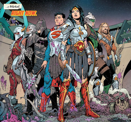
Most modern superhero comics feel like action figure catalogs. Every story involves a new costume, or an alternate-reality version of a character, or a new character taking over the title temporarily. It just feels like the creators are stewards of an IP, adding value to the original concept by spinning a variant into existence that will one day be molded into plastic and sold.
The first issue of artist Greg Capullo and writer Scott Snyder's DC crossover comic Dark Nights: Metal is basically everything modern audiences want in superhero comics: wall-to-wall action, decorated with a bunch of Easter eggs that call back to decades of convoluted continuity. It opens with the Justice League in outer space, being forced into gladiatoral combat, and it expands into a secret society revealing the imminent invasion of a grave threat that might destroy the universe or whatever.
Snyder and Capullo create at least two sets of likely profitable action figures in the first ten pages of this book: Gladiator Justice League and Voltron Justice League. Later, we see silhouettes indicating yet another variant: Evil Alternate Universe Batman Justice League. Plus, Batman rides a dinosaur and he almost says the word "ass," both of which are sure to wind up in some listicle on some zombie comics news site as one of the Top 15 Most Awesome Moments In Comics This Year. (You can practically read the breathless copy now: "Four words: Batman. Riding. A. Dinosaur. 'Nuff said.")
There's an obvious high level of competency in the actual craft of the comic. Snyder is very good at getting information across in a very small space, and Capullo is better than most superhero comics artists at designing a page. They seem to work well together, and the book is technically very proficient.
But the last page involves a character who simply shouldn't be there. I won't spoil the big surprise, but let's just say it's akin to the revelation that DC Comics is incorporating Alan Moore and Dave Gibbons's Watchmen comics into mainstream DC continuity. It feels like another pointless violation of another barrier, and it cheapens a much-loved comics property by turning it into a plot point. But hey — at least it'll make a really cool action figure line one day.
Your Week in Readings: The best literary events from August 16th - August 22nd
Wednesday August 16th: Why Poetry Reading
Matthew Zapruder isn’t a Seattle poet, but he edits for Seattle-based Wave Books and he publishes with Port Townsend-based Copper Canyon Press. His newest book is a self-described “impassioned call for a return to reading poetry” titled Why Poetry. While generally demands that people should read poetry are like telling kids to eat broccoli, Zapruder is a brainy and passionate advocate. Sorrento Hotel, 900 Madison St., 622-6400, http://hotelsorrento.com. Free. 21 and over. 7 p.m.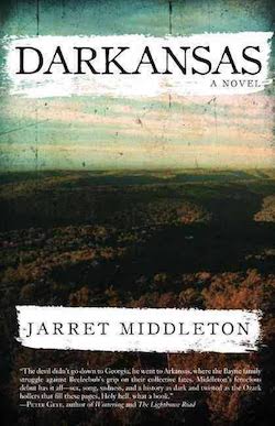
Thursday August 17th: Darkansas Reading
Seattle writer Jarret Middleton’s first novel, An Dantomine Eerly, was a surrealistic book about the death of a poet. His second, Darkansas, is about a country singer who comes home to the Ozarks to attend his twin brother’s wedding. Meanwhile, his father’s ghost lingers over the proceedings and things get really creepy. Elliott Bay Book Company, 1521 10th Ave, 624-6600, http://elliottbaybook.com . Free. All ages. 7 p.m.Friday August 18th: The Pox Lover Reading
Everyone’s favorite interlocutor, Seattle’s own Mattilda Bernstein Sycamore, interviews journalist Anne-Christine d’Adesky about her memoir of lesbian activism and global refugees. Sarah Schulman says the book is “Reminiscent of the luscious lesbian literature of the Parisian past but propelled into the era of AIDS, ACT UP, and the Lesbian Avengers.” Elliott Bay Book Company, 1521 10th Ave, 624-6600, http://elliottbaybook.com . Free. All ages. 7 p.m.Saturday, August 19th: Fun Home Book Club
Now that all the drama nerds are excited about Fun Home because of the musical that just came to town, it’s important to recall that Alison Bechdel’s first memoir is a complex and beautiful work of literature on its own. Come talk about one of the best comics of the last 20 years with a group of comics fans. Outsider Comics and Geek Boutique, 223 N. 36th St., 535-8886, http://outsidercomics.com/. Free. All ages. 5 p.m.Sunday August 20th: Cephalopod Appreciation Society
See our Event of the Week column for more details. Waterfront Space, 1400 Western Ave., https://www.facebook.com/CephalopodAppreciationSociety/ Free. All ages. Noon.Monday August 21st: Booze and Lasers: All the Birds in the Sky
We tend to have fewer readings at this time of year, which means it’s time for you to visit some book clubs! This new boozy book discussion group is devoted to appreciating recent sci-fi gems by women and authors of color. Their most recent selection is Charlie Jane Anders’s sci-fi-and-fantasy mashup, All the Birds in the Sky. Third Place Books Seward Park, 5041 Wilson Ave S, 474-2200, http://thirdplacebooks.com. Free. All ages. 7 p.m.Tuesday August 22nd: Found: A Life in Mountain Rescue Reading
Bree Loewen is the leader of Seattle Mountain Rescue, a volunteer organization that saves the lives of people who get lost in the wilderness. Her memoir about those rescues — successful and not, famous and obscure — builds into a portrait of the region’s outdoor community. Read it while you’re still able to get out to the mountains for a few more weeks. King County Library, Redmond Branch, 15990 NE 85th St,, 425-885-1861, http://kcls.org. Free. All ages. 7 p.m.Book News Roundup: Donald Trump is not children's book material
Seattle poet (and the current poet in residence here at the Seattle Review of Books) Daemond Arrindell is the curator for the 2018 Jack Straw Writers program. That means Arrindell will choose the writers who take part in the program, and he'll take a leadership role as the writers learn how to share their work as spoken word and in recordings. Jack Straw is taking applications for the program through November 1st. You can apply right here.
Electric Literature reports on what one indie bookstore did when some fascists came in and tried to use their store as a marketing campaign for an alt-right douchebag's book.
Headline of the week: "I Bought a Book About the Internet From 1994 and None of the Links Worked." We think of the internet as lasting forever, but the truth is that this is a very fluid medium.
A Texas assistant principal was forced out of his job after self-publishing a children's book. It sounds truly awful — and by "it," I mean the book, not the fact that the guy lost his job:
The book features allusions that may go over some children’s heads. The setting is a farm called Wishington. The antagonist is a bearded alligator named “Alkah.” Astute readers will recognize Covfefe cliff. But perhaps the most inflammatory aspect is the smiling cartoon frog, which NBC News has called a “popular white nationalist symbol.” “Pede,” the name of the cartoon centipede that also graces the book’s cover, is also a term members of a Donald Trump-themed Reddit board use to refer to each other.
Spoiler alerts ahead, but Pepe and his centipede sidekick Pede start the book ecstatic that the old farmer has left after eight years of oppression. But Alkah and his minions have entrenched themselves in a pond that very much resembles a swamp — and are threatening to spread throughout all of Wishington Farm. Pepe and Pede have one weapon to vanguish the gator: buds from the honesty tree.
Literary Event of the Week: Cephalopod Appreciation Society
Sierra Nelson loves cephalopods. Squids, octopuses, cuttlefish — you name it, if it’s a bilateral mollusk with a big-ass head, Nelson is positively gaga over it. Nelson is a Seattle-area poet, and you can understand how a poet might fall in love with betentacled sea creatures: they’re romantic figures, skulking in the ocean — a part of the great marine biosphere, but also remote from the whales and fish. Those articulate limbs and big brains set them apart from the rest, leaving them to skulk and mope fabulously. And they even produce their own ink! How could a poet not land on Team Cephalopod?
But Nelson is more science-minded than your average poet. She’s a co-founder of the Vis-á-Vis Society, which applies scientific rigor to crowd-sourced poems, often employing large crowds at parties to write, Mad Lib-style, a series of poems about love and longing. No other poets in town have likely dissected a poem into pie charts on a whiteboard while wearing a lab coat.
On her own, Nelson loves to tease out the poetry in science, finding resonance in the long and mysterious Latin words and phrases that we’ve used to name the world. One of my favorites of her poems is “The First Photograph,” which explains the process that created a blurry heliograph by the father of photography, Joseph Nicéphore Niépce:
Through the pinprick it all came to us,
how close we were, upside down,
several hours on the windowsill.
We were surfaces arranged to receive.
The poem concludes: “Yet I capture you. Close to the sun./I coated my longing in bitumen.” Much has been written about the way photographs capture a moment in time, but rarely is that desperate need so beautifully overt.
So yes, there’s whimsy in Nelson’s celebration of all things squid and squid-like. But there’s also serious investigation and a questing mind, fusing together science and art and seeing what happens. She’s been throwing Cephalopod Appreciation Societies every year since 2015.
The Cephalopod Appreciation Society is a multidisciplinary arts celebration with music, film, visual art, poetry, and speeches. Past participants have included musician Lori Goldson, biologist Stephanie Crofts, marine cinematographer Laura James, and novelist Kevin Emerson, and presentations have included stickers, classes on incorporating marine biology into creative writing, octopus-themed animation, and sea shanty singalongs.
This year’s Society is in a different setting: whereas past assemblies happened at the creative hub of the Hugo House, this year’s edition meets on Sunday, August 20 at the Waterfront Space, a gallery on Western Ave. Nelson encourages participants of all ages to come dressed as their favorite cephalopod, and she promises there will be a “mini-parade” to the waterfront, presumably where she will call on a giant squid to rise from the deep and cast a judgment on Seattle. Will we be destroyed by the mammoth monster from the briny depths? Or will our suction-cupped friend recognize the like-minded intelligence in our eyes and guide us to a happier future? Only our molluscular overlords know for sure.
Unstacking the deck
Published August 15, 2017, at 12:00pm
It's comforting to blame the 1 percent for economic inequity in the US. But surprise — the enemy is us.
Someone should write the sci-fi novel that America really needs to read right now
Nazism is on the rise in America, even though the generation that fought Nazis is still alive. I can’t be the only person who’s wondered if humanity is destined to repeat this resurgence of racists and white nationalists every 60 to 80 years, when the memory of the last battle has grown sufficiently dim.
Nazism is a virus. It passes from one infected person to another. The Charlottesville rally on Saturday was especially dangerous because the white supremacists didn’t wear masks; they very likely activated hundreds of other white supremacists who have to date been too ashamed to speak out in public about their own racist views. This is how it spreads. We have to be careful to not give these people platforms, because they will share their sickness far and wide.
Just as we can defeat sicknesses through inoculation and education, I have to believe that things will get better eventually, that we’ll learn from our own mistakes and eventually figure out a way to end this toxic cycle of racism. We can't keep making the same disgusting mistakes over and over.
We have plenty of examples of racism-free futures to look to for inspiration. Star Trek presented a color-blind society that had elevated beyond the horrific self-destructive behavior we’re seeing in 2017. And while Neal Stephenson’s novel Seveneves has its own complicated relationship with race, there is a passage late in the book that suggests the racism of the old planet Earth had been successfully eliminated.
So there are plenty of science fiction novels that show us a future in which Nazism and white supremacy have been eliminated. But so far as I know, there is not a science fiction novel showing how Nazism and white supremacy are eliminated. Some author somewhere should write that story: explain in stirring, dramatic detail how humanity manages to rise above its most toxic impulses and come together as one.
Don’t just skip ahead to the future: do the hard work of telling us how it happens. Rather than giving us a destination, share a roadmap. Give us a story where decent humans finally crush Nazism into nothingness. This is the sci-fi story that we need right now.
Family Tree
After Natasha Marin’s Red Lineage
my name stumbles ups the stairs
climbing towards grace, an ascending arc of red and goldmy mother's name mends shards back to glass
melts them down with the heat of a thousand hearts,
an aged and forgiving redmy father's name lives in a spoonful of shadows
hungering for a cloud that will rain redfollow the seedlings and you will see
my name become a little kite dancing in the wind,
stand still under the cicadas’ summer song
and see my mother's name strut
to a living and slowly dying beat of red
breathe in the fire’s flicker and my father’s name
tending to the embers collapsing red.I come from a people known for speaking without saying,
for spitting the shine on their boots & stomping blackness
into the heavens.
With the greatest of ease
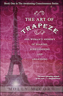
We've all dreamed about making the big leap: a new job, a new country, a new life. Molly McCord did all three, leaving a stable but unsatisfying career in Seattle to start over in Paris, a city she'd never seen. She shares the story in The Art of Trapeze — part memoir, part instruction manual for choosing a different path. As the title implies, trusting yourself as your feet leave the platform is the hardest and most necessary part. Read a sample chapter, provided just for Seattle Review of Books readers, and enjoy McCord's trademark blend of humor, honesty, and self-reflection. If you like it (and you will), the book is twenty percent off through August at her site.
Sponsors like Molly McCord make the Seattle Review of Books possible. Did you know you could sponsor us, as well? Get your stories, or novel, or event in front of our passionate audience. Take a glance at our sponsorship information page for dates and details.
Conservative author clearly has no respect for booksellers
Just in case you weren't sure that convicted felon and self-described "disgraced" conservative attack dog Dinesh D'Souza is a horrible person, look no further than his tweet from Sunday:
This argument is more relevant than ever as the media left tries to use #Charlottesville to promote its Big Lies about fascism & Nazism pic.twitter.com/58uAfB2Tn0
— Dinesh D'Souza (@DineshDSouza) August 13, 2017
Rather than be embarrassed about the subject matter of his new book, which tries to tie liberals to Nazism, D'Souza is trying to profit off of the Charlottesville neo-Nazi rally.
As if to demonstrate what a bad thinker he is, D'Souza covered the rest of a new arrival table with copies of his book in order to seem like a big deal. But he does a shit job of it — you can see the other books peeking out from underneath his — and you just know he didn't clean up after himself.
My favorite response to D'Souza's tweet comes from Seattle author Adam Rakunas:
First person to send me a picture of my books stacked on top of Dinesh D'Souza's at a bookstore gets a signed copy of LIKE A BOSS.
— Adam Rakunas (@rakdaddy) August 13, 2017
If you take Rakunas up on his offer, please remember to clean up after yourself. Don't be a D'Souza. (And read Like a Boss, which is a wonderful book about labor unions in outer space.)
Talking with Steve Toutonghi about all the work a book cover has to do
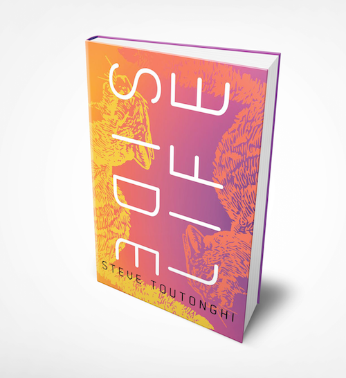
Next May, Seattle author Steve Toutonghi is publishing his second novel, Side Life, with Soho Press. Today, Toutonghi and Soho are exclusively sharing the book's cover with Seattle Review of Books readers. (That's it right up above this paragraph.) The novel — about a discouraged internet entrepreneur who takes a demeaning job as a housesitter in a billionaire's tech-haunted mansion — has to convey a lot of information in its cover: it has to look futuristic but not too distant, it has to convey the sense that it's a thriller, and it has to stand out from all the rest of the books that will be coming out next year. I talked with Toutonghi about the process of creating and choosing a cover for a book, and what kind of work he thinks a successful cover has to do. This interview has been lightly edited.
Our readers are very interested in the relationship between writers and the covers of their books. I think people tend to believe that authors have a lot of control over that process, but most of them don't. Tell us what the process was like for you. This is your second book, and it’s your second with Soho Press, right?
Yeah. I'll start with the last book, because I think it may have influenced how things went with this one. I really didn't have much of an idea of what to expect that first time. I received a proof of the cover and I loved it, and I wrote back to Soho that I loved it, and that was pretty much my degree of involvement in the cover design, which was fine with me.
With this one, when I received the cover file I thought it was just an incredibly smart interpretation of the content. I had some conversations with booksellers about the function of the cover in different contexts, and so I had a question I wanted to raise with the publisher, and I said, "What about this thing that I heard might be a concern for booksellers?" And then they took my concern into consideration.
And a couple weeks later they sent the new proof of the cover — it was same concept, but I had asked a question about the colors that were used, and they adjusted the color. So all in all, it was a very positive experience. Certainly, they listened to me, and they took it into account. But they, you know, started the design process and sort of walked through the initial context and all that stuff without me, I didn't have visibility into that. The things that I did get were really polished, professional, very smart takes on the content of the book.
So I was happy with the process, but I didn't have a lot of sort of early input into it, which was actually probably the right thing to do because they know what they're doing. Covers are really complex — they're doing a ton of work. The designers who work on them have worked on a lot of projects, and the people at my publishing house do a fantastic job. I'm more than happy to have the kind of experience that I had with them. It felt like a very, very much the right degree of influence for me.
Yeah, writers are not necessarily great at visual communication. Often I think what a writer senses a good cover might be is a little bit distorted. Are there any covers of books that are not your own that you really enjoy? And, conversely, are any covers that have always bugged you as a reader?
Honestly, you know, there's this whole kind of line of covers that are using conventions of genre. To me, they’re covers that seem cheesy or not all that interesting. But in a lot of cases the people building those covers are talking with an audience that I'm not really used to communicating with, so I don't know really what they're doing. I feel a little reluctant to pass judgment on them. I'll look at a cover and think, "well, I'm not super-excited about that," but that doesn't necessarily mean the designer didn't hit their marks or do the thing that they were trying to do.
Right, there's a common language in genre covers that fans understand. Your publisher Soho is in the mystery space, but their books don't look like the covers of a lot of mysteries and thrillers that are out there, right? Their books certainly don't look like the sort of thing that you think of when you think of Sue Grafton or, you know, The Girl with the Dragon Tattoo.
Yeah, I agree. I don't know if you've seen their Soho color map? They have a poster that they printed in 2016 where they had their mystery authors aligned by color. The point of the poster was showing that they had this large library of very high-quality mystery writers and their design process had resulted in enough similarity to show them as a library with a coherent visual identity. One of the ways that they're doing a really incredible job is through their focus on high-quality design and doing things right.
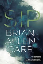
There’s a book that's coming out from Soho shortly, Sip by Brian Allen Carr. I think that's a beautiful cover. I love the way that the title is sort of partially obscured by the smoke, and I think it's very elegant and also a little threatening. Also if you read the synopsis it seems appropriate for the content. I haven't read the book, but -
[Reading the synopsis] “…the highly regimented life of those inside dome cities who are protected from natural light…,” OK. That makes sense.
And people drinking their shadows.
Yeah. That looks very appropriate, and in the hands of another publisher, I bet it would be more genre-y. Not that there is anything wrong with that.

Yeah, and I think if you want to go into action, they also have Robert Rapino's books. Those books have, I think, a really striking visual identity that's really clear and that speaks, I think to sort of the precision of the concept. The animals get smart and attack the humans and fight with each other. The covers really speak to the big-concept clarity of the world he's creating.
They're very sort of cool and futuristic.
Yeah, but isn't it interesting how it can be cool and futuristic, and also just a cat's face?
Yeah.
I like that. I love that. And then diverging from Soho, there's a lot of really cool things happening from Viking books. What they did with the redesign of the Murakami books — I think those are really cool.
They fit altogether in sort of a unified graphic, which is crazy, and the elements kinda spill off one cover and onto another.
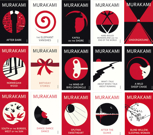
I hadn't seen them like this all laid out together like that. Yeah, that’s kind of a dream for an author, right?
I think so.
When I started reading novels, there were the Vonnegut covers with the giant "V." They don't really have much of a graphical element on them, but that's how I read through Vonnegut. I would look for those books and find them and read them based on their covers.
That’s an interesting example, because I know exactly what you're talking about. My mind immediately calls up an image of them.
So bringing it back to your cover for a bit, you said you got some advice from a bookseller on the new cover. Can you talk a little bit about what the bookseller's input was?
I'm just going to talk generally about conversations I've had with booksellers about covers, and not specifically about the covers of my books. So, for example, I'm used to going to a bookstore and I'll see a cover — the spine of a cover, or the cover's facing on a shelf. Booksellers talked a lot about the cover existing on a table in the context of a bunch of other books, which was something I hadn't really thought very much about. And you know, the facing cover on a shelf is in a different context because it's likely to have spines on either side of it. And then, you know the spine is another context. But on the table, you want a cover that's going to pop a little bit, that's going to suggest that a person browsing the books on the table pause and pay attention. You want something that won't wash out.
One of the booksellers talked a lot about how he liked the covers to have some kind of internal color tension, so that it didn't rely on tension being established by books next to it. Because colors in the publishing industry sometimes move cyclically. So, a certain pallette becomes widely used, and then there's sort of a movement to another pallette.
Oh yeah, that's totally true. I think last year at this time bright yellow was in vogue — you would just go into a bookstore and there would happen to be like five bright yellow books on the front table at a bookstore. And it's not coordinated, obviously. Nobody wants their book to look like everyone else’s, but it's just one of those weird things that happens with fashion and design where people follow trends without even realizing it.
Yes, and so he was saying, “look, you're going to run the risk of that happening. So try and create some contrast on your cover, so that if you get into that situation you don't lose the browser's eye as they pass across the cover. I thought that was interesting.
It seems like there a lot of conversation about the degree of legibility — there's a tension between the legibility of the text and the freedom of graphic design that the designer feels that they can explore as a way to express the emotional content and emotional relationship with the book. I think that's really interesting — how the designer approaches the idea of legibility versus the emotional design.
Can you talk about where you think the cover of your new book resonates with the story?
The story has a note of urgency, but it is also set in a very familiar context. And so they did this really wonderful thing with the colors. The colors are kind of bright and they pop and the title is two really simple words, but they’re arranged in such a way that there's this nice tension. So I feel they did a really good job of connecting the design and the content of the story.
And then there's cats, which provide familiar context and are potentially comforting. But the cat in the story has a really specific role, and I think it's nicely reflected in the way that the cat appears on the cover.
I'm sort of at the edge of my seat to see what will this look like in the context of a table at a store.
Another thing that I like about that cover is the text is sort of large and bold, but also part of the overall composition in a nice way. So the cat and the colors become kinda abstract as you shrink down to Goodreads size. For me, I feel like it's successful at communicating that sense of tension and familiarity at the various sizes you’ll see the cover in. It's important to do that.
That hadn't even occurred to me: the different ways covers are presented these days. You've got to communicate the book’s contents on a table with a bunch of other objects. You have to communicate it as something that belongs on somebody's shelf at home, but you also have this postage stamp size that's got to grab people's attention on social media. That's a lot of levels.
It really is. There's so much going on. There are so many moving parts that as an author, it’s really useful to me to feel comfortable that I have people who are experts, who have experience, and who have a track record advocating for their concerns in the design process.
It's like this crazy, very complicated moving target, and it's amazing how many beautiful covers are out there, given all those constraints.
The Sunday Post for August 13, 2017
Each week, the Sunday Post highlights a few articles good for slow consumption over a cup of coffee (or tea, if that's your pleasure). Settle in for a while; we saved you a seat. You can also look through the archives.
"Ready Player One" is a terrible book and it will be a terrible movie
There’s nothing like a solid takedown, especially of a book that, apparently, many people disliked but were afraid to confess to disliking until the movie trailer came out. We could go deep here on how nerd culture became cool, and whether we’ve hit peak nerd and are ready for a nerd backlash, but maybe let’s just take this at face value: Ready Player One had the references, but not the heart, of Among Others. One round was enough.
Nearly every one of Ready Player One’s faults is a direct result of Cline’s authorial narcissism. The writing process appears to have begun with the question: What if the entire world revolved around me, and the specific video games and movies I like? The rest was assembled around that essential core. Cline is far from the first author to write a self-insert wish fulfillment narrative, but he may be the first to write one this lazy and self-indulgent.
At the heart of every restaurant
It’s a narrow line: spend a day in one of the lowest-paid and least-respected jobs in the food industry; write a shiny, self-deprecating-but-not-really, slice-of-life story; but don’t condescend or overwrite the reality of working your ass off for very little money in an environment where your colleagues may not even speak your language.
Food critic Tom Sietsema does a reasonable job with his recounting of a day as a dishwasher in a high-pressure restaurant kitchen, and there’s lot of interesting stuff about the job itself — and how the job is changing, thanks in part to successful chefs who got their start with their arms buried in suds. Here’s hoping equal salary goes along with the new titles and upgraded uniforms.
The median annual wage for the 500,000 or so dishwashers in the United States is about $20,000, up only $4,000 or so from just over a decade ago. But a few restaurants, including the French Laundry, give cleaners the stature of sous chefs and extend titles that capture the broad range of responsibilities.
“We don’t call them dishwashers, but porters,” says Keller, who got his start washing dishes in his mother’s restaurant, the late Bay & Surf in Laurel, Md. “We give them the same respect we give anyone else in the restaurant.” Indeed, the only difference between the embroidered uniforms worn by his chefs and his porters are the latter’s short sleeves.
The Front Row
This series of photographs of front-row fans, taken by documentary photographer Jessica Lehrman from the concert stage, are stellar: the human face (and body) burning with adrenaline, jubilation, awe, and fury. Look especially for the outliers in each image — the stone-faced security guard, the blue-lit skeptic, the man whose eyes drift from the star and meet the camera dead-on.
The front-row fans are willing to be crushed against a metal barricade, hundreds, maybe thousands of people swaying and pulsing behind them, all connected to the same rhythm.
There are weepers, Instagrammers, those who need to live-stream all their experiences.
The fanatics know every single word.
Nobody Knows What Lies Beneath New York City
There’s a surprising amount of romance in Bloomberg Businessweek’s soul — witness this piece by Greg Milner on NYC’s subterranean mirror. We’ve mapped the surface of the planet down to the last ripple and bump; maybe the final frontier is under our feet.
New York City’s daunting infrastructural labyrinth is like the “Here be dragons” decorating ancient maps. Underneath the 6,000 miles of asphalt and concrete road lie thousands of miles of water, sewer, gas, telecommunications, and electrical infrastructure. And let’s not forget the 500 miles of underground subway tracks or Con Edison’s 100-mile steam delivery system. In its entirety, it’s known to no one.
The Loveliest Living Fossil
An ode to the numero by type designer Jonathan Hoefler, a geeky piece that philosophizes about punctuation, reminisces over a few lost forms (the asterism!), and winds its way to a detailed exploration of the main character (pun intended). The internet is swarming with this kind of “inside look” from industry experts; here’s an enjoyable example based on real knowledge and obvious love for the subject.
At its leading edge, punctuation is volcanically active, giving shape to concepts that move far faster than words. Anyone communicating today has seen #topics and #themes and #categories identified this way, using a symbol that was intuitively understood and replicated even before it was first called a hashtag in 2007. The symbol and its meaning are now universally recognized, transcending even the locality of language, but their use is scarcely a decade old — an astounding accomplishment for a bit of lexical fluff, when you consider that the newfangled OMG was first recorded in 1917 (and in a letter to Winston Churchill, no less.)
Only a few days left in the Seattle Writing Prompts short story contest, judged by Matt Ruff
Normally, in this space, you'd find a Seattle Writing Prompt. Today we're pre-empting to bring you this reminder to enter our short story contest.
So, writers, take note: August 15 is the deadline for our short story contest. Tidy up your commas, tighten up your characters, and hit “send” by midnight Tuesday. We can’t wait to see what you’ve made.
We’ll pay $100 to publish the winning story — and run an interview with the author by co-founder Paul Constant the same week. Get your story in front of our readers, and get to tell your story to our readers. It's great exposure, and we're paying you to get it!
Really, a writing contest, on a book review site?
Yes. Seattle is home to fantastic writers, established and emerging, and we want to see your name on the site.
Every Saturday, we run the Seattle Writing Prompts: a column that explores a part of Seattle and offers prompts based on the city’s history, or mis-history. Rain City’s home to a million stories, and many of them are yours.
This is our first-ever story contest, and we don't publish fiction very often. Our judge is local writer Matt Ruff, author of Lovecraft Country — just listed as one of the finalists for the Washington State Book Awards.
How it works
Look through our Seattle Writing Prompts archive and take inspiration from one of the prompts.
Write a short story whose concept was sparked by the prompt. You don’t need to follow it exactly, but it would be nice to see where you began. Format is open — flash fiction and comics score just as high as longform. Surprise us.
Submit your story, and let us know what prompt inspired it, by August 15, 2017. We’ll do an initial pass, then send them on to Matt Ruff. We’ll announce his pick here in early September.
Send to submissions@seattlereviewofbooks.com, with the subject line “Seattle Writing Prompts Contest Entry.”
About our judge
Matt Ruff is the author of six novels; the most, recent, Lovecraft Country is a WSBA finalist and set to become a series on HBO, produced by Jordan Peele and JJ Abrams. Matt’s novel Set This House in Order was a Washington State Book Award winner in 2004.
Fine print
You’re selling us, essentially, first serial rights to your story. You retain full copyright to your work. There is no minimum or limit on word count, but we are looking for short stories instead of prose poems. You can be the arbiter of what that means to you. We consider comics short stories. We pay on publication. Interview will require you to meet with someone from the site for about 30 minutes, but that can be on Skype if you can’t do it in person. You do not need to live in Seattle to enter this contest, but we retain the right to weight stories with strong Seattle connections more heavily.
You may recall that Ivan Schneider — frequent contributor and friend of the Seattle Review of Books — in his interview with David Shields, talked about his delicious outsider theory on how Cervantes intended Don Quixote to have a talking dog character.
Schneider turned that theory into an academic paper titled "The Search for Dog in Cervantes", which was just published in the peer-reviewed Humanties journal, in their special "Animal Narratology" issue. You can read the whole thing online.
This Tuesday, August 15th, Ivan is hosting a private event at Mercer Street Books to celebrate the publication. If you would like to attend this memorable event, contact Ivan for an invitation. It sounds like it will be one for the ages.

The Help Desk: Downward dog-earing
Cienna Madrid is on vacation. Please enjoy this column from the 2015 Help Desk archives. And please remember to keep sending your questions! Do you need a book recommendation to send your worst cousin on her birthday? Is it okay to read erotica on public transit? Cienna can help. Ask her at advice@seattlereviewofbooks.com.
Dear Cienna,
Is dog-earing the pages of a book morally, ethically, or spiritually wrong? What about underlining?
Brooke from Capitol Hill
Dear Brooke,
In a world where Ted Nugent, Donald Trump, and Mark Driscoll can all boast of being New York Times bestselling authors, I have a hard time labeling anything short of a ham sandwich wrapped in pages of the Koran as morally, ethically, or spiritually wrong (especially if the infidel sandwich is thrown its own ticker-tape parade in Mecca during Ramadan).
But I digress.
A good book should have a much longer lifespan than you and far more friends than could fit at your funeral. So yes, there is an etiquette to how you handle good books and this is it: Use pen only for inscriptions. If you want to underline or respond to select passages, do it in pencil so that when you’re dead, your loved ones can read your thoughts and then carefully erase them. If you highlight anything outside of a school textbook, you are a dick (even then, turning text an aggressively hard-to-read shade does not make it more knowable. Learn to take notes like a civilized person.)
Finally, don’t dog-ear pages. On the scale of infidel sandwiches, this gaffe is more upsetting than sacrilegious (think Jesus stumping for Subway’s new gluten-free tuna melt). Still, if you can’t find one old receipt, gum wrapper, divorce decree, etc. to mark your place in a book then you're about as useful as Trump's thoughts on the economy, Driscoll's thoughts on women, and Nugent's thoughts on everything else.
You’re welcome,
Cienna
The Glass Castle puts a Hollywood lie on a true story

"When it comes to my family," Jeannette Walls scolds her fiancee early in The Glass Castle, "let me do the lying, okay?" In this part of the film, Walls is portrayed by Brie Larsen as a steely gossip columnist, and the line is delivered with a forcefulness that makes it clear she's not kidding. It's an interesting line to begin the film with, because Castle is based on Walls's memoir of the same name, and it's one of those memoirs that feels too sensationalistic to be true.
Walls grew up in a nonconventional family: her brilliant alcoholic father kept them moving around the country, often to avoid arrest for some confrontation or another. Her mother was frequently oblivious to the danger surrounding her children. And her three siblings were raised without access to traditional education or financial security. Unlike some of the other too-crazy-to-be-true memoirs of its time, though — Running with Scissors, for example, was largely deflated — Castle seems to have withstood the scrutiny that came with its bestseller status. It's one of those horrible, bizarre stories that feels like a lie, but is actually true.
And now here comes Hollywood to blur the line between reality and fantasy. This adaptation of Castle deserves your respect, at least, for not giving the book the softball treatment. There are scenes of child endangerment in this movie that will make most adult viewers clench every muscle in their body. Jeanette's father Rex (Woody Harrelson, giving a half-brilliant, half-cliched performance) is a charming rogue and also a sloppy, violent drunk. The family is at once a coherent, loving unit and an abusive snowball of codependence, hurtling toward destruction.
I'm making it sound less entertaining than it is. For its first half, Castle is a breezy movie with some genuinely funny lines and two or three masterfully shot sequences. The film is structured along two timelines, with an adult Jeannette reflecting back on her life in flashbacks, and the screenplay does a decent job of slowly revealing the complexity of its characters over the distance of many scenes.
And the narrative is buoyed by some fantastic little character touches along the way. Rex fiddles with a doorknob while expounding in a grandiose monologue about all the unnecessary problems the Malevolent Doorknob Industry has unleashed on the world, and the moment feels perfect to the character and nicely underplayed. The child actors are terrific. For a few brief moments, it seems like the kind of movie that might get remembered at Oscar time.
Unfortunately, Castle can't sustain that momentum. The score is so treacly that it consistently undermines the film's emotional beats. Adult Jeannette's struggles are portrayed as too pat. The aging and de-aging of characters leaves a lot to be desired—Larson is not a convincing high schooler, and Harrelson looks too old to be young in early scenes and too young to be old in later scenes. And the movie is too quick to forgive some heinous actions that deserved more contemplation.
Still, Castle is better than its mid-August dumping ground release date would indicate. At least three scenes — an arm-wrestling match, a swimming lesson, and a domestic dispute that spins out of control — are perfect examples of how to effectively build and release tension. But the artificiality of some of the other scenes and the unevenness of Harrelson's and Larson's performances detracts from the book's central strength — the insistence that no matter how outrageous it gets, the story is the truth. At its heart, the film feels like a lie that glosses over something much more interesting.
Portrait Gallery: Danzy Senna
Each week, Christine Larsen creates a portrait of a new author for us. Have any favorites you’d love to see immortalized? Let us know

Monday August 14th: New People Reading
Danzy Senna is one of the very most interesting social writers the 21st century has yet to produce. Her long-awaited new novel, New People, is about a biracial couple who find themselves divided along lines that they don’t fully comprehend. Senna explodes American conceptions of class and race in ways that will make readers completely uncomfortable.Elliott Bay Book Company, 1521 10th Ave., 624-6600, www.elliotbaybook.com. Free. All ages. 7 p.m.
Future Alternative Past: Present tense
Every month, Nisi Shawl presents us with news and updates from her perch overlooking the world of science-fiction, fantasy, and horror. You can also look through the archives of the column.
Conflict vs. tension
Something's got to happen. Who wants to read about happy characters dwelling contentedly in the land of status quo with no worries, no desires, no agendas? Paying customers prefer action. We authors love our characters (who are often facets of our own selves), but in pursuit of stories others will read we torture and provoke them, prod them, plumb their depths.
Conventional Western wisdom declares that at their heart, good stories are about conflict. In the U.S. we’re taught to categorize the types of conflict found in a story in simplistic terms: Man against Nature, Man against Society, Man against Man, and Man against Himself. (Note the gender specificity.) And writers are trained to satisfy readers with these closely educated tastes.
But I counsel my students to aim for a slightly different focus. Because conflict can be just as boring as its absence.
Consider the pitched battles of epic fantasy. Good fights evil, and unless we’re in the territory of grimdark authors like Joe Abercrombie, the outcome’s pretty much a foregone conclusion. Though epic battle is frequently deemed a Western trope, its use is by no means restricted to European inspired fantasies: despite my deep admiration for his short fiction, Ken Liu’s novel The Grace of Kings wore out my patience with its repetition of military scenarios well before I finished the book, and that was only the first volume of his Dandelion Dynasty trilogy. Battle after battle. War after war.
So what else is there? What keeps readers scrolling? I say it’s tension.
Kishōtenketsu, a traditional East Asian narrative structure explained in depth on the tumblr of still eating oranges, is one alternative. As Nils Odlun notes in the first article linked, in kishōtenketsu the author turns their focus from conflict to a different aspect of the story. Conflict may produce the tension necessary to attract and keep readers’ attention — there may be a struggle, complete with winners and losers — or there may be something else going on that dramatically changes what the characters and, through them, the audience, experience. The point is not the event depicted on the page but its effect.
Weirdly, my tension epiphany occurred as I watched the end of Doctor Zhivago. Yes, I know this is a deeply problematic movie, and not even SFFH — but I still managed to learn from it. As Omar Sharif chased Julie Christie through the streets of Moscow, dying of a heart attack before getting her to notice him, I was caught up in their story as never before. He had to reach her. He would never reach her. This gap between “What is” and “What must be” was the space where the spark of my imagination leapt to life. The arc it jumped.
Where else in fiction do I find these seductive lacunae? Lots of places. Karen Lord’s first novel, Redemption in Indigo, can be read as your standard conflict, but the djombi Lord’s heroine contests with for possession of the Chaos Stick is also, according to kishōtenketsu theory, the means of resolving the disequilibrium this prize’s presence creates. In other words, I find tension’s power there because I’m searching for it. I put it in my stories in hopes you’ll seek and see it or stumble across it or figure out somehow it’s there.
Recent books recently read
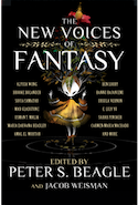
Looking at magic in unfamiliar ways, the emerging authors brought together in The New Voices of Fantasy (Tachyon) freshen up the genre’s much-sought sensawunda. Within these pages it’s everywhere: in amorous mobile skyscrapers, ravished tornado shelters, and blissfully ignorant anthropologists’ notebooks. Most effective are the tales of those whose difference could easily have disqualified them from inclusion in past authorial pantheons. The half-sulking, half-singing cadences of Sofia Samatar’s Hugo and Nebula Award-nominated “Selkie Stories Are for Losers” might not have made it into this newly formed canon because of her East African heritage, despite her academic status; the mazing reflections of Usman T. Malik’s British Fantasy Award-winner “The Pauper Prince and the Eucalyptus Jinn” might have been brutally trimmed back or eliminated altogether, their South Asian cultural currency disregarded as valueless. But we’re all so much the richer for the strange, beautiful wealth to be found throughout this entire book.
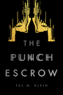
The Punch Escrow (Inkshares) by software marketer Tal Klein also affords a novice’s take on established SFFH tropes. As numerous YouTube videos and late-night TV hosts have pointed out, our Star Trekkian concept of teleportation basically boils down to a traveler’s duplication followed by their murder. In 1995 James Patrick Kelly addressed teleportation’s ethical dilemmas in his Hugo winning novelette "Think Like a Dinosaur"; Klein’s revisitation features a narrator whose day job is being a professional smartass and who lards the text with breezy, confident-sounding footnotes full of quantum foam and peeing mosquitoes. Good fun.
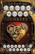
So what’s a new voice? What’s an old one? Is there anything in-between? Daniel H. Wilson, author of The Clockwork Dynasty, already has beaucoup books out, including the awesome Robopocalypse and its sequel, Robogenesis, and my personal nonfiction favorite, Where’s My Jetpack? Clockwork’s steampunky cover promises brass gears and leather and lots of them, and readers looking for the Retrofuturism typically associated with these trappings won’t be disappointed. Much of the book’s action takes place in 18th- and 19th-century Europe, with forays into modern times and also, interestingly, into the distant past of the Chinese empire. One of the novel’s two viewpoint characters is (this is not a spoiler, trust me) a robot created millennia ago by vanished supermen. Wilson’s academic expertise is robotics, enabling him to make his references to the spinning, metal-impregnated ceramics animating these Ur-androids’ somehow credible. According to him robots have been with us always. Though new, they’re incredibly old. A neat trick in perspective and a pleasing one.
Couple of upcoming cons
The self-proclaimed largest SFFH convention in the whole freakin universe, Dragon Con, is also home to the Dragon Awards. Like Worldcon’s Hugos, the Dragon Awards are recent victims of Puppy voting manipulation schemes. Unlike the Hugos, award categories include both comics and graphic novels, and four separate game varieties. This wide spectrum of choices reflects the literature-plus orientation of Dragon Con, with its weighty emphasis on movies, cosplay, and a myriad other ways to interface with the unknown.
Another large, multifarious SFFH shindig, Archon, has historically taken place in St. Louis, MO. Its occupancy of a hotel in Collinsville, IL likely has more to do with negotiated stay rates and facility availability than the travel advisory issued by the NAACP, but this is still a good opportunity to support a forty-year-old institution without validating its home state’s troublingly oppressive legislation. Plus Seanan McGuire tops this year’s list of Guests of Honor, and plenty of swoony pros are sure to attend among the approximately 2000 others showing up.